A New User Experience for Google+
Rachel Moss
November 19, 2015

Google+ moves interests to the front and center of its new user experience strategy.
People talked, and Google listened. As of yesterday, Google announced a new focus on building interests-based communities through its Google+ social networking platform. According to Google, there are two features people kept coming back to: Communities, which now average 1.2 million new joins per day, and Collections, which launched just five months ago and is growing even faster.
But did Google stop there? No, the new Google+ home stream has also been reinvented with a much more simplistic look and navigation structure to put what matters most to user first – Collections and Communities. Check it out for yourself below.
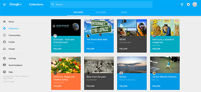
Next time you visit your Google+ page, you might see a new Collections feed such as this:
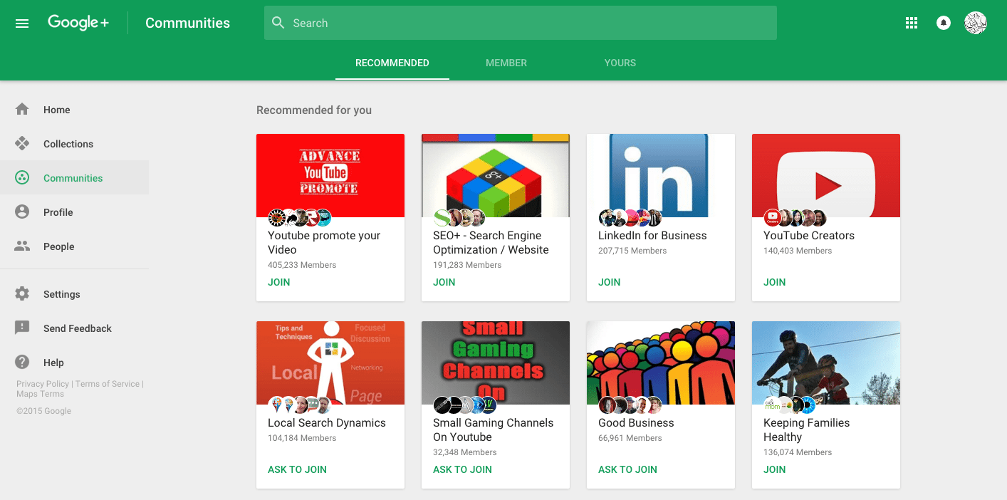
Your Google+ Communities Feed will also have a new look to it, similar to the one below for our Fuzzy Duck Google+ page.
Google commented that this new design will make it easier for users to post, search, connect, and keep up with the content that matters most to them. Better yet, the platform is now more mobile-friendly with these changes being applied across web, iOS, and Android devices. To use the new version of Google+, you’ll have to opt-in, which you can find out more about here. Give it a try and let us know what you think!