Google Releases Material Design 2 With New Features and Tools
Jared Law
May 18, 2018
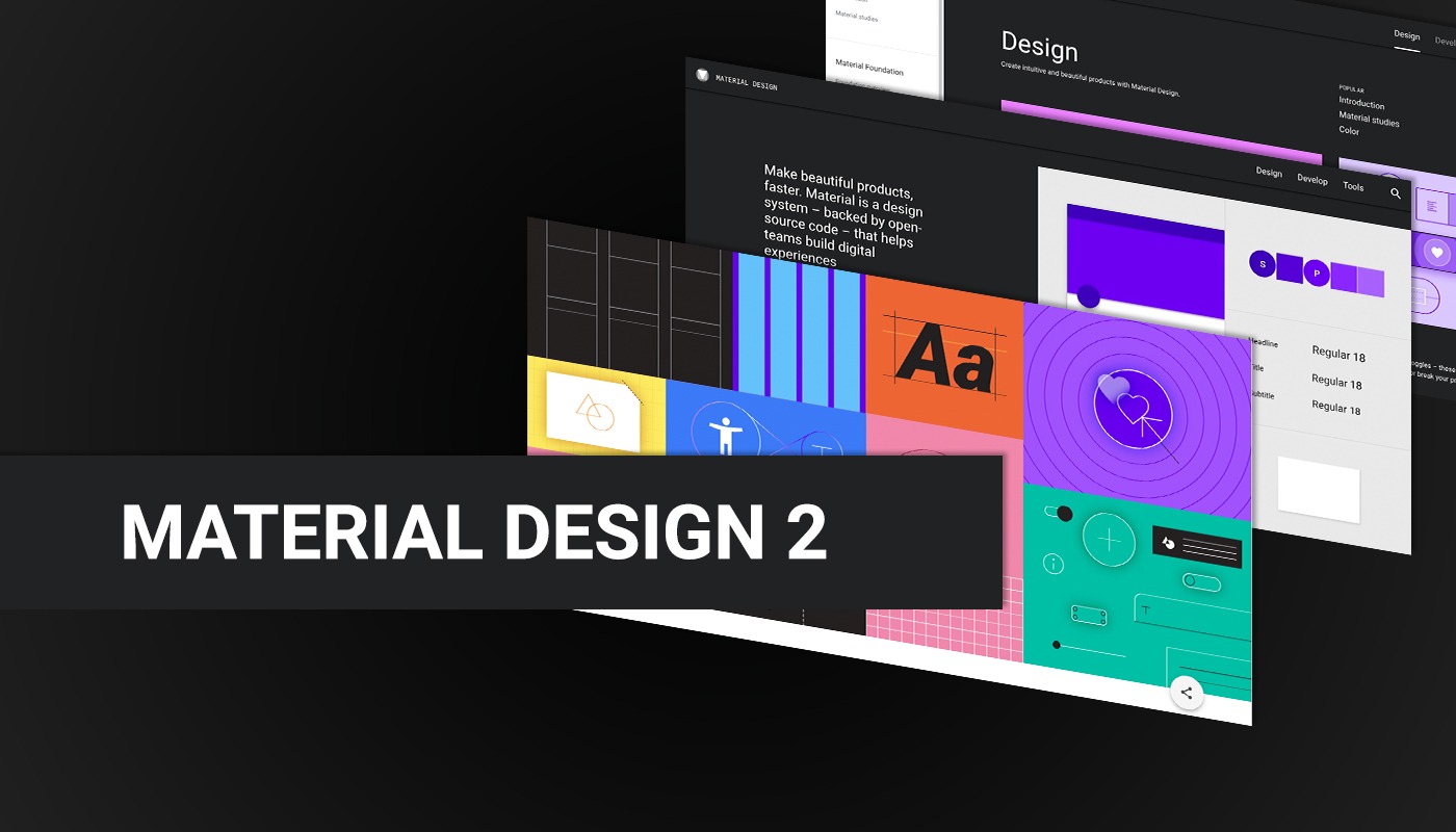
Google has just released Material Design 2.0 – bringing a host of new features, tools, elements, and my personal favorite ( Material Theming ).
Originally launched in 2014, Google’s Material Design has been the visual style guide for all of their products and services, and has been a major visual design influence in the rest of the digital world. Even when taking all of Google’s products and services out of the consideration, it would be nearly impossible to go about your daily digital activities without visiting a site or using an app that doesn’t utilize aspects of the visual style if not Material Design itself.
What Is Material Design?
One of the original concepts of Material design is to bring intuitive interactions and understanding of information hierarchy that exist when interacting with physical material into the digital realm.
When someone picks up a tabbed notebook, you understand that there are several sections of the notebook due to the colored tabs that stick out from the side of the book. The tabs provide the notebook with organization between content and you intuitively know that you can grab the tabs to quickly flip between content sections.
Applying Material Design to the digital design space, you see an interface with color contrast between the content “paper” and the navigation / user interface element “tabs”. Subtle shadows provide a sense of physical depth, providing a visual hierarchy and separation between user interface and content elements.
When used consistently, Material Design can improve a user’s literacy with a product by creating a consistent experience from one application to another. The user doesn’t have to look for the navigation, or wonder if this item is a button. They already know where to expect these elements and what they do because they have seen and used similar elements on other products.
So Why Was It Updated?
One of the goals of the release of Material Design 2, is to solve a few gripes that have existed within the design and development world, design customization being at the forefront. That is where the previously mentioned Material Theming comes in.
With the new tool set that comes with Material Design 2, you are better able to adjust the colors, typography and shapes of UI elements. Material Theming doesn’t completely revolutionize the appearance of an application, but it does help create visual separation between your product and others while maintaining the overall user literacy that comes with using Material Design.
With the new tool set, you are better able to adjust the branded appearance of your service or application through colors, typography and shapes of UI elements. This is a big win for designers, developers, and users.
What Are the New Tools and Features of Material Design 2?
There is a lot that is new with this release, but here is a quick breakdown of what we like the most.
Material Theme Editor
This is an amazing tool for allowing a design team to get up and running, and the best part is it is integrated into one of our favorite design applications, Sketch! This plugin lets a designer apply a visual change, like a button color or typeface of an element and see that change cascade throughout application design. This can be a big time saver, allowing the designer more time to explore more ideas and impactful content features.
Gallery
Gallery is an online tool for collaborating on design work with frontend development tie-ins. Working together with Sketch and the Material Theme Editor, Gallery lets you post designs and comments, and even tracks design revisions. These are all great features for the designer, but as noted earlier, there is something for frontend developers too. You can inspect designs and view design parameters, or even check out documentation links for Material Design components.
Material Icons
Icons are an interesting aspect of web design and app design projects. Clients tend to apply a great deal of focus on the icons throughout the design process, looking for changes to color, style, etc… But they don’t always value the time and cost that it takes to apply those icon elements. Material Icons can help both the client and the overall design budget by providing a healthy amount of icons with several styles and color options.
Where Can I Learn More About Material Design 2?
All good tools deserve good documentation, and that is what Google has provided with material.io. This comprehensive resource site provides tons of documentation and examples for the design, development, and tools featured in this release.
So, if you have any questions on the details of Material Design 2, material.io is a great place to start.
If you have questions on how Material Design 2 can be used in your application, give us a shout and we would happy to go over it with you.
