Keeping Your Written Content Digestible
Brenna Connolly
October 10, 2022
")
You know how it feels to look at a big sea of text – an entire page of body copy. It can be overwhelming as you sigh to yourself thinking, “Yeah, there’s no way I’m reading all of that!” As a writer, I acknowledge that the way my writing is presented visually can be just as important as the valuable information it holds.
When writing content, I can help the designer with their job by assembling content that lends itself to visual design, therefore; making it easier for our mutual audience to find what they are looking for and digest it.
It’s also important for writers to understand where and how the written content is being used because readers look for and consume information differently on a mobile website than they do would in a printed brochure, for example.
Web Readers Want Information Fast
When written content is presented in a strong visual design, it connects with your readers’ subconscious brain as well as their eyeballs, drawing them in visually to find what they’re looking for. So, when writing for the web, it’s essential to make the content itself modular so that the designers have the freedom to break up the content into digestible sections.
When visiting a business website, for example, visitors need to be able to find key information like phone number or location address right away. But they also need to be led to more substantial info they are looking for.
Ways to Break Up Text Walls
In professional marketing terms, a key strategy we use to make content easier on the eye is one we refer to as “chunking it up”. What I mean is, making content into more digestible “chunks” of text that differentiate themselves visually. To do this, it’s important to combine captivating and informative headlines with small sections of written content, like short paragraphs, bulleted lists, or a series of steps. Also helpful are relevant charts and visuals, text callouts, and font variance. Chunky!
Text Design Is Needed In All Kinds of Content
More than just for use on the web, many types of written content can benefit from a little visual design. In many cases, written content for businesses is there to inform the audience and solve their problem. Content design can be particularly helpful when you know the audience will be skimming the text. Other useful applications might be:
- Presentation slides
- Product descriptions
- Resumes or proposals
Restaurant Menus Can Be Appetizing & Digestible
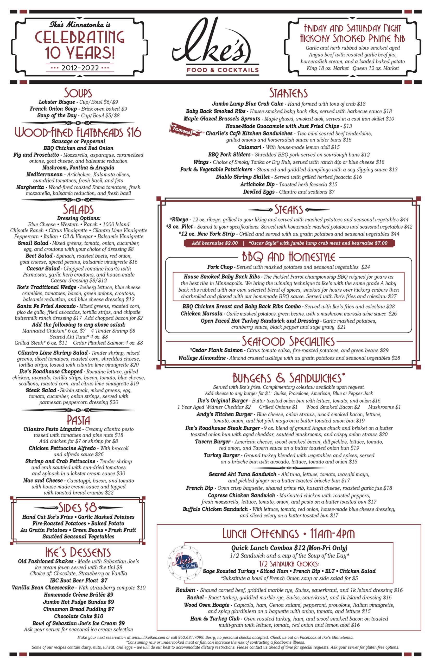
Now, there’s one kind of visually-designed written content that we’ve all experienced. Ye old restaurant menu. Restaurant menus are designed with skim-ability in mind. They typically feature clear sections of text with a hierarchy of information. Sometimes they feature small boxes with sub-menus to call your attention to house specials or seasonal offerings. All of these things help to direct the reader to what the restaurant wants them to see and it helps diners find exactly what they are looking for.
Take a look at this menu we designed for one of our favorite restaurant clients – Ike’s. The layout of the menu, the boxes used, the variance in font type, and font weight to create headings and sub-headings help guide you to a decision on what to have for dinner! These menu features all help the diner get to the answer they want quickly.
Imagine that you’re at Ike’s. It’s lunchtime and, boy, is your tummy grumbling! You’re ready to sink your teeth into a juicy burger. You don’t even have to scan that salad section, and you certainly aren’t interested in any soup, so you follow the headings right to the burger and sandwich part of the menu.
When your peepers land on that burger section, you take in the names of their signature burger selection, and now you need a little more information about each one. You scan the additional text under each burger subheading. Now, it’s not a whole recipe they lay out for you, it’s a few key ingredients you need to know. Think of those as the bullet points under the subheadings. Mhm, mhm. Cheese, pickles, a little onion, and some wood-smoked bacon? That Tavern Burger sounds pre-tty good to you!
But wait, does anything come with that? Your eyes scan the burger section for additional details. Score! It’s right up under the heading, see? Your selection comes with fries and coleslaw, too. (Can you tell I’m a little hungry?) Because of the succinct way the menu is laid out, it’s easy to get right down to what you want and make a choice quickly.
Help Your Readers Open Up Wide and Consume Your Content
Help readers find the answer they’re searching for, or optimize your current content for search engines by:
- Creating chunks of content
- Using informative headlines – stop clickbait now!
- Divvying up content into bullet points and numbered lists
- Adding charts and graphs where relevant
- Varying font size and type
Do you need help making your content more digestible, whether in print or online? Click below or give us a call at 952-449-6800. We would love to help!