

Wake Up and Smell The Mobile
Brenna Connolly
December 6, 2022

Are you reading this on your phone right now? You may or may not be, but you should know that a significant section of the population is accessing the internet ONLY through their smartphones. What’s more, roughly 60% of people accessing the internet, in general, are doing so via mobile.
Your website needs to be optimized for mobile! If your site just isn’t cutting it on mobile yet, it’s essential that you get with the times.
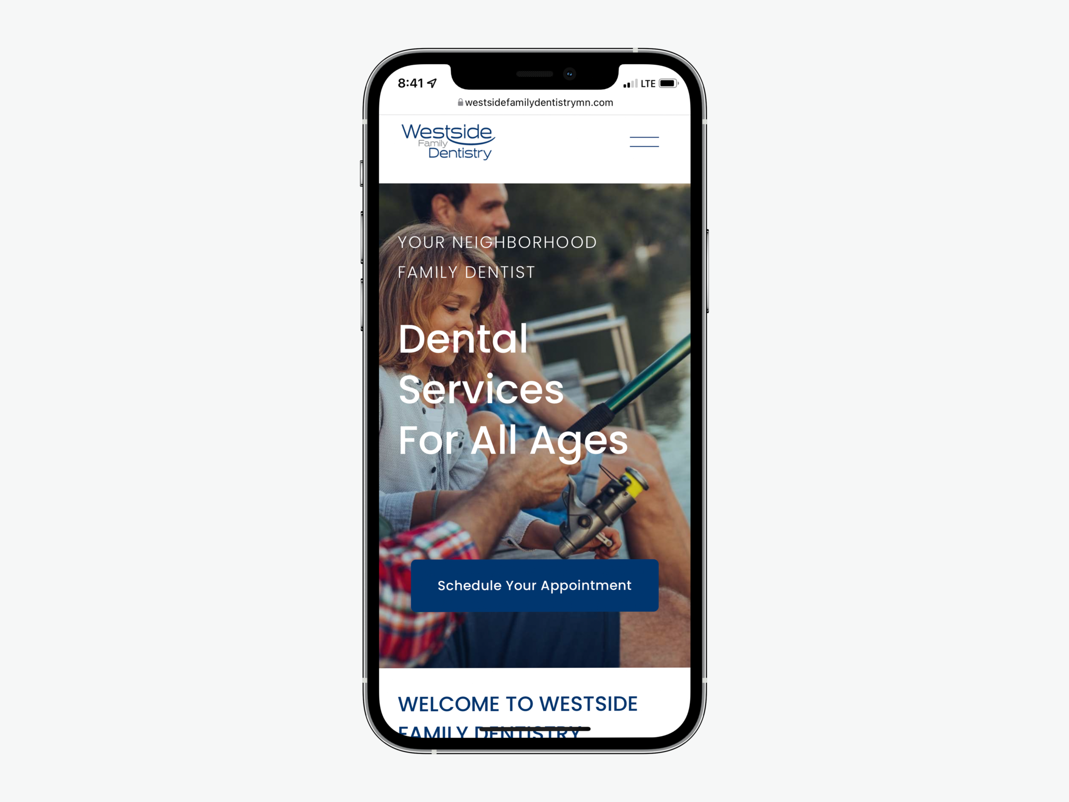
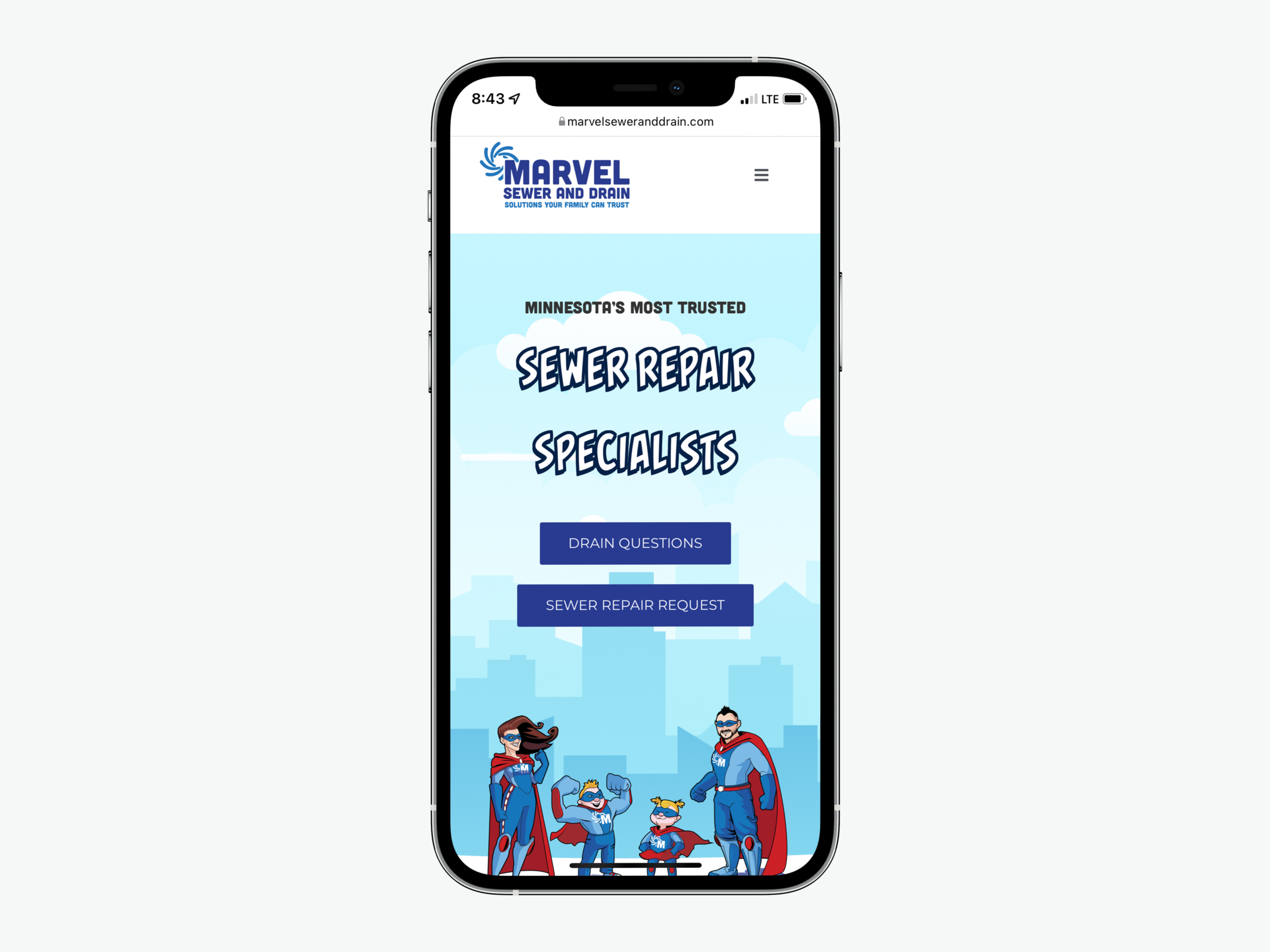
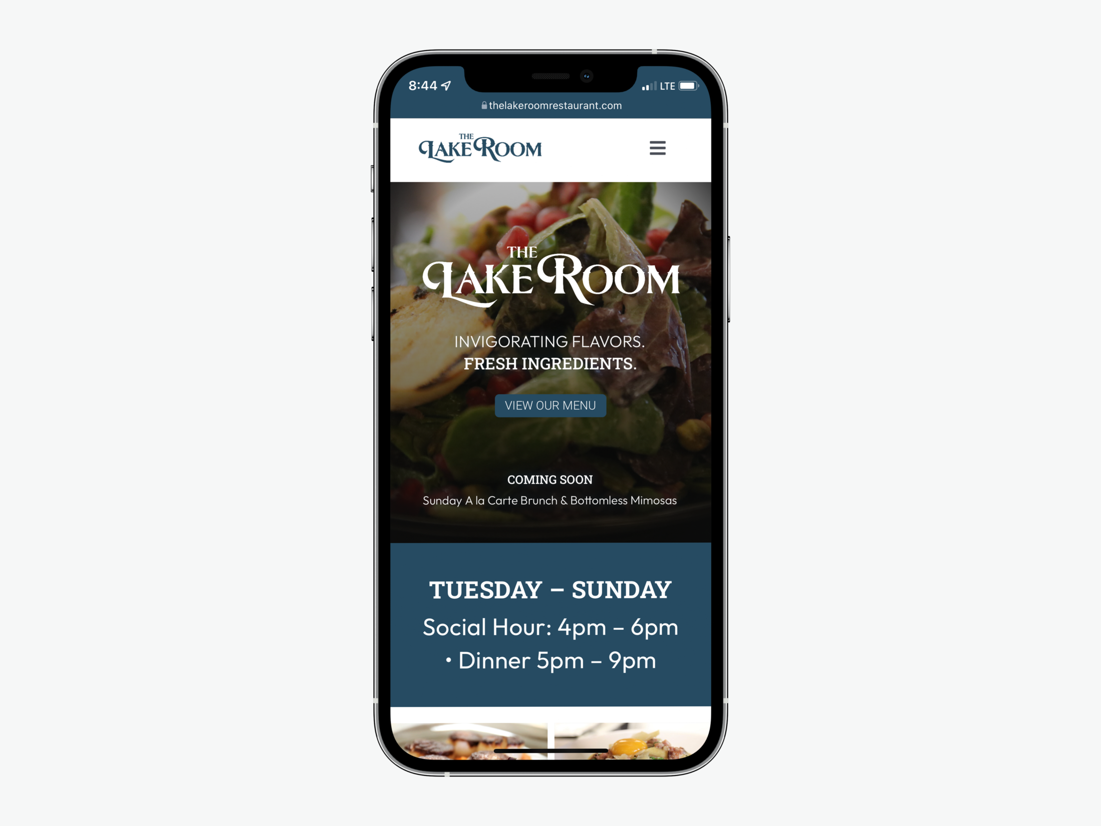
What is “mobile-responsive”?
So what does a mobile-responsive site look like? Having a mobile-responsive site means that the text and web elements of a site will automatically scale to fit a mobile screen. This ensures that, at the very least, mobile users aren’t going to have to zoom in to read tiny text or click a simple button. Being truly optimized for mobile means that there are dynamic features of a site that are compatible with your phone’s features. Apps can be opened by interacting with the site to enable placing phone calls, sending emails, and navigating to locations right from your contact page.
Mobile shopping is on the rise
In preparing for the holiday shopping season, one bit of advice we gave was to level up your mobile shopping experience. That’s because ecommerce, and its most recent evolution – mobile commerce – is only growing in popularity. Per Adobe, smartphones drove a record 61% of retail visits and 43% of spending during the 2021 holiday season. Adobe forecasts that by 2024, 70% of retail purchases will take place on mobile ecommerce sites. Don’t miss out on these sales!
Making mobile users mobile buyers
If you’re looking to increase sales and conversion, you need to seriously consider the power of mobile. In fact, Google found that 70% of smartphone owners who bought something in a store first turned to their devices for information relevant to that purchase. 65% of people use their phone in their “I-want-to-buy” moments, most often to go to a retailer’s website or to search. Make sure your website provides a great experience for the mobile user! Adobe advises that conversions are increased when a mobile experience is designed specifically for mobile shoppers.
Whether they’re trying to find a place to eat, something to wear, or a place to get an oil change, mobile users are buyers, assuming you can meet their needs. In order to meet those needs, make sure that the next step in your sales funnel can be accomplished via mobile. If you’re a restaurant, allow people to secure a table from their phones using an online reservation portal. If you’re a resort allow them to book their room with a streamlined reservation experience. If you’re a brick-and-motor store, allow them to buy online and pick up in-store (BOPIS) with an ecommerce solution. Catch your customers while they have a need in mind and are actively searching for a solution.
Fuzzy Duck can build it
All of the sites we build at Fuzzy Duck are optimized for mobile browsing as part of our development process. If you’re looking to incorporate a third-party software, we can work to seamlessly integrate that too! These considerations can have a significant effect on your mobile web users’ experience.
Don’t underestimate the importance of mobile as you look to enhance your website!


