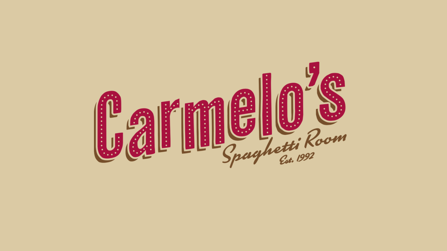
Carmelo’s Spaghetti Room

The creative process is a journey, one that requires trust, collaboration, and a willingness to explore unexpected directions. Sometimes that means presenting ideas that spark conversation and point us toward better solutions. Other times, it means circling back, refining, and reimagining until every detail feels right. What sets our approach apart is simple: we never stop until we get it just right.
Collaboration is Key
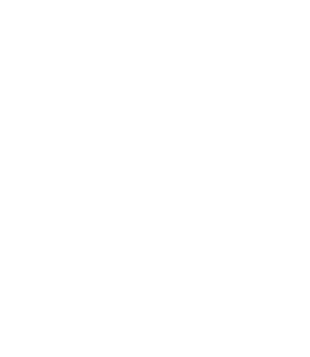
When designing a logo for a new restaurant concept, a blank slate leaves a lot of room for interpretation. The possibilities are endless, but without clear boundaries, the path forward isn’t always clear. Sometimes, you don’t know what you want until you see something you don’t.
That’s why the design process hinges on strong, ongoing communication between us and our clients. It’s a collaborative journey, where each conversation and each iteration brings us closer to capturing the true identity of a brand. For Carmelo’s Spaghetti Room, these early designs worked to uncover the soul of the restaurant and translate it into something memorable.


We presented the first round of designs knowing they’d spark important conversations. And they did. The feedback we received was specific, nuanced, and incredibly valuable:
- “Carmelo’s” should be the dominant element, with “Spaghetti Room” supporting .
- Lean into the playfulness. The brand should represent a sense of ease and relaxation.
- The aesthetic should be formal, grounded in classic Italian charm, but with enough warmth to feel inviting.
- Above all, it should feel like stepping into a friend’s house where you know you’ll be well taken care of.
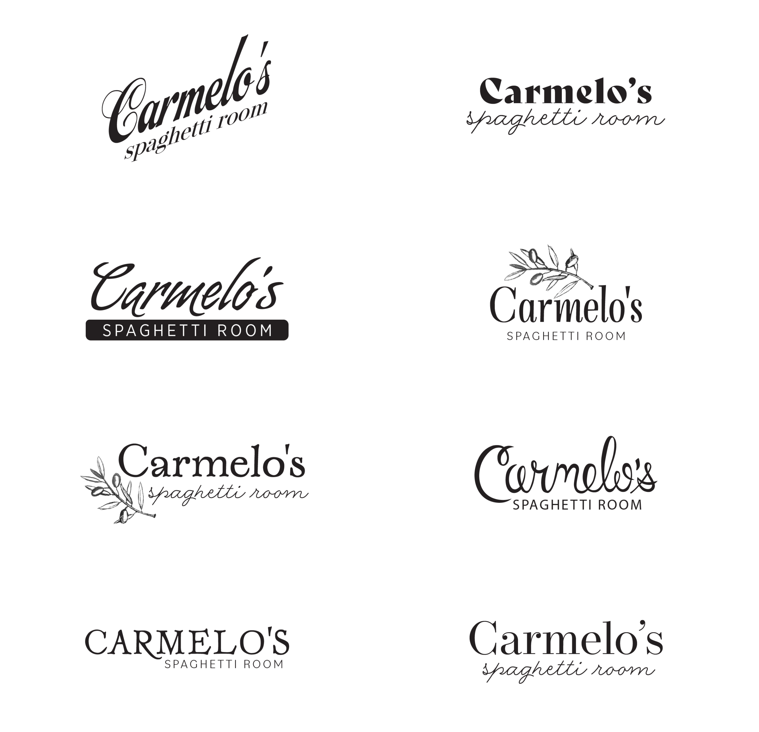
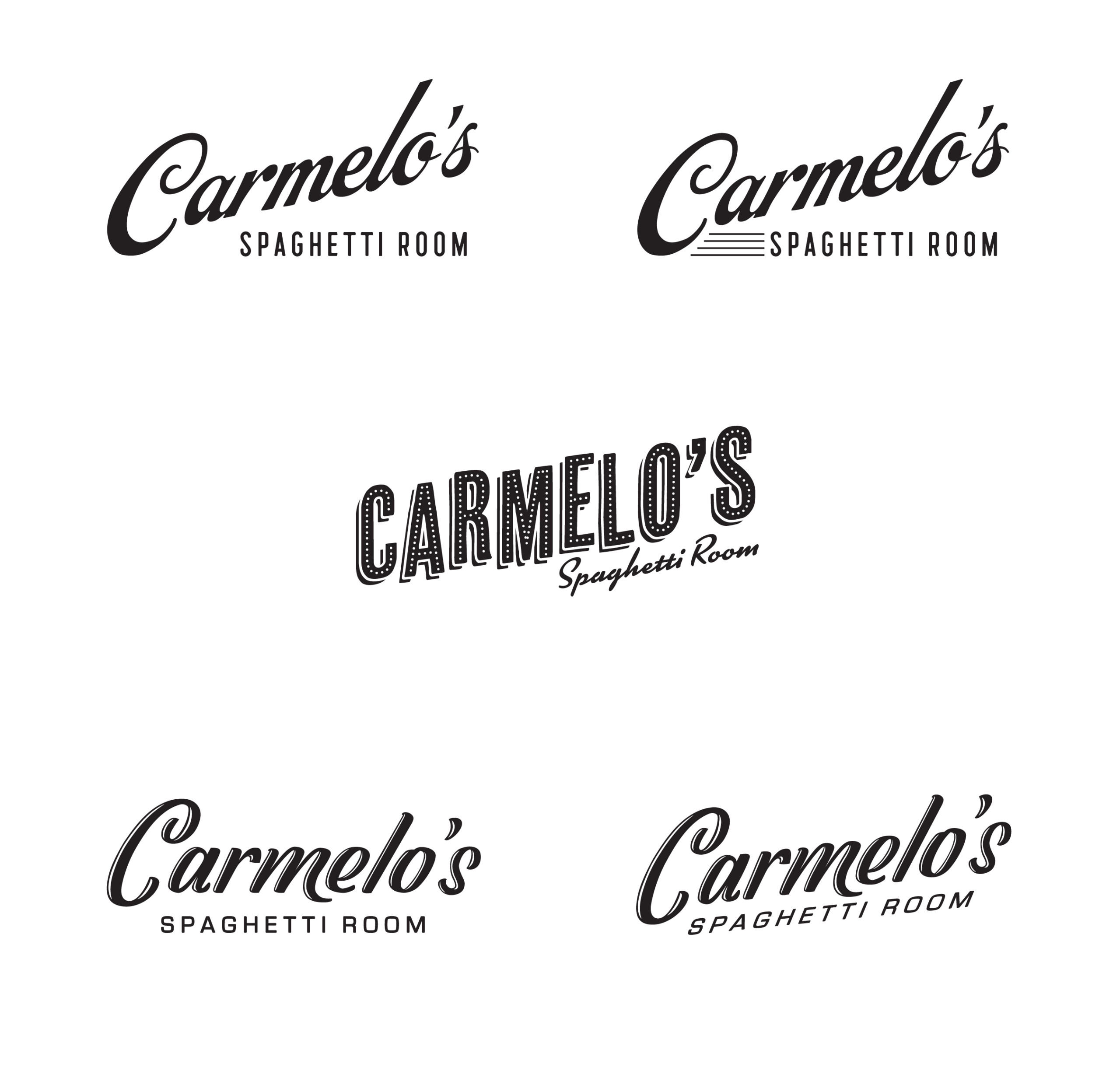
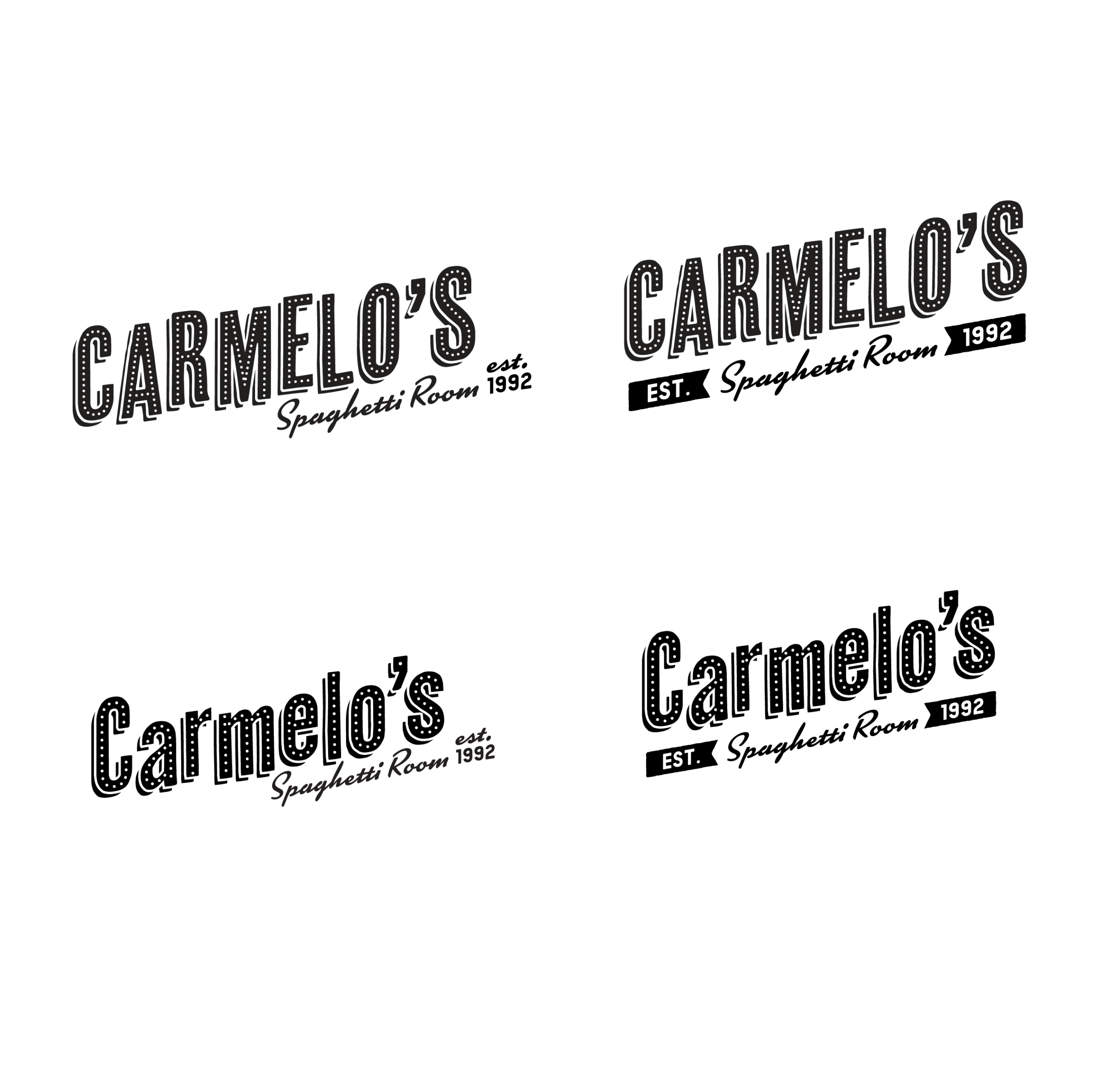
Armed with this clarity, we dove back into the design process with renewed focus. After a few more rounds of exploration, we started inching closer to what truly represented Carmelo’s. That’s when things got exciting. One of our favorite parts of the logo process is when all the pieces click into place and we start refining a design direction with confidence. It’s a magical moment when a concept transforms into an identity.
In the end, we landed on a logo that balances that timeless old-world Italy feel with the vibrant playfulness of mid-century modern marquees. The result is something that feels both nostalgic and fresh. A visual identity that is distinctly Carmelo’s.

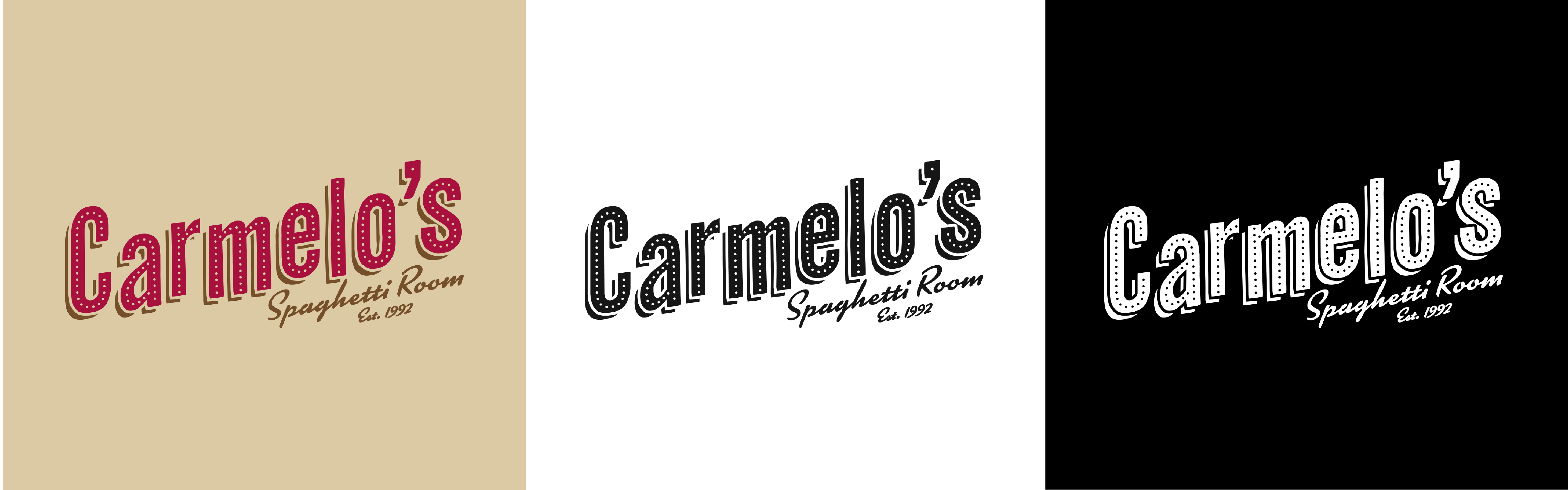
Simple Always Wins
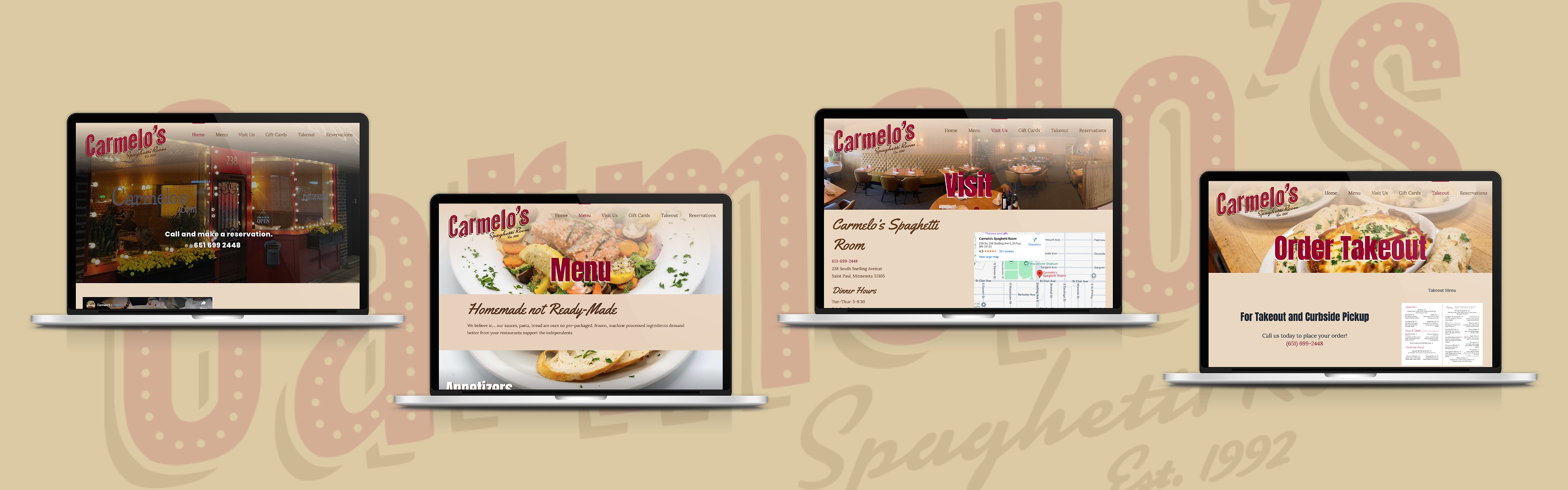
Once the logo was finalized, Carmelo’s brand theme was fairly well established, and we had a clear foundation to build upon. Then came the exciting challenge of translating that brand identity to the website. We wanted to encompass all the emotion embedded in the logo—the nostalgic nod to classic Italy, the vibrant playfulness, the cozy warmth—while staying true to the owners’ primary intention: simplicity. Just an honest, beautiful reflection of what Carmelo’s stands for.
The quote featured on the home page of their website really says it best:
“All we are trying to be is… a really nice place, with really good food, and really good service. That is it.”
~Mark & Shelli
This guiding philosophy shaped every decision we made, from layout to typography to imagery, ensuring the website felt as welcoming and straightforward as the restaurant itself.
Better Together
At the heart of everything we do is partnership. We thrive on working with collaborative partners who value the design process as much as the final product, and we’re especially energized by new concepts that challenge us to push boundaries and explore new creative territory. Every project is an opportunity to grow, experiment, and create something truly unforgettable.
If you’re looking for a design partner who will champion your vision and won’t rest until it’s brought to life in the right way, we’d love to hear from you.