The Psychology of Color
Brenna Connolly
December 6, 2022
Colors can have quite an effect on us, either positive or negative. Designers can spend a lot of time deciding on just the right hue because they know how important it can be to the perception of a design!
Color psychology is the study of how certain colors impact human behavior. While it’s true that colors have psychological effects on us, beliefs about particular colors are also culturally held and vary worldwide. A lot of the ideas we have about color are evident in the metaphors we use. You’ll see what I mean!
Additionally, color psychology is also impacted by our personal preferences and abilities. While certain color combinations are more pleasing to the rods and cones in our human eyes, everyone likes something a little different. And someone who is colorblind will certainly have a different perception of color than someone who isn’t!
All this to say, the science isn’t airtight, but the bottom line is that the colors you choose can greatly impact the success of a design or even the mood in a room! Let’s have some fun and explore common color associations to keep in the back of your mind.
To learn more about the psychology of color, explore these specific colors and their associations.
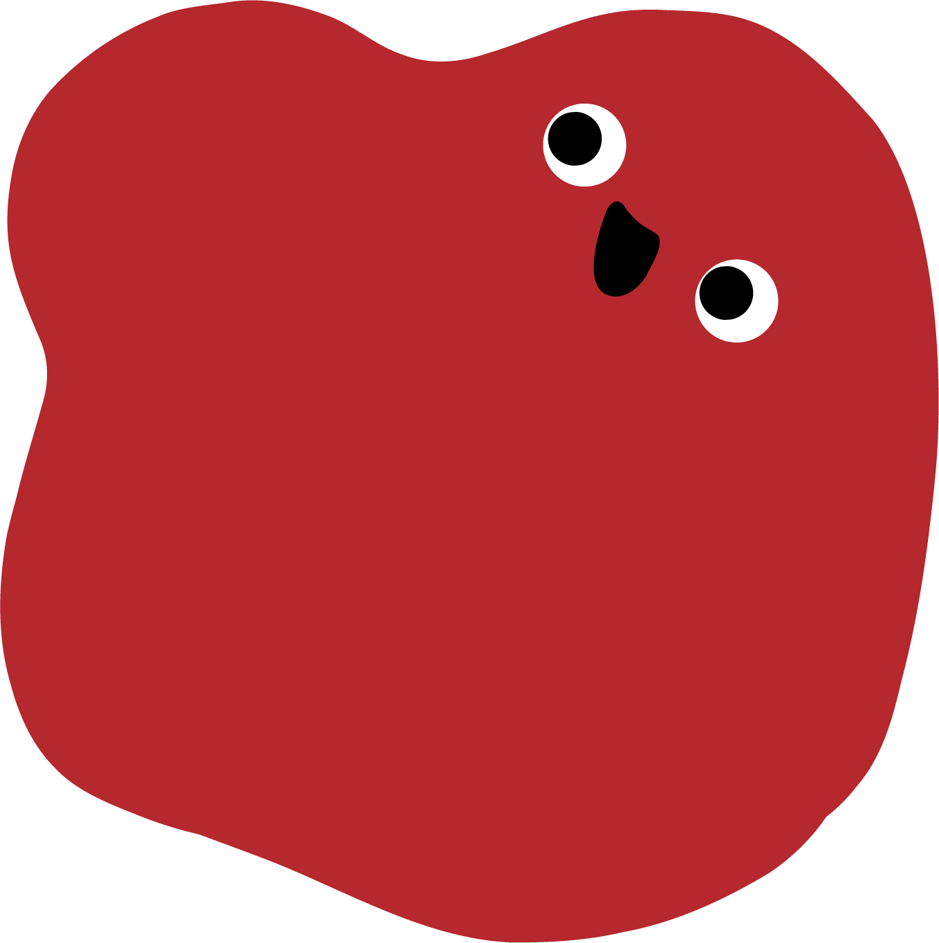
Red
Red is a color often associated with energy and boldness. It gives a bright pop and certainly catches the eye. It’s even been said that the color red can actually evoke an increased appetite in its viewers. That’s likely why so many fast-food companies incorporate red into their branding.
Additionally, studies have long been conducted on the effect of the color on win likelihood. That’s right, some studies suggest that wearing a red-colored uniform in a sports game increased the odds of coming out with the W. However, a more recent 2022 study suggests that this may not be the case. Jury’s still out, but red is certainly associated with power.
But, be careful! Red can also indicate anger (red with anger), warnings of danger (in the red, red flag), or elicit a sense of urgency (red zone). Carefully consider how the use of this color might influence the tone of your message.
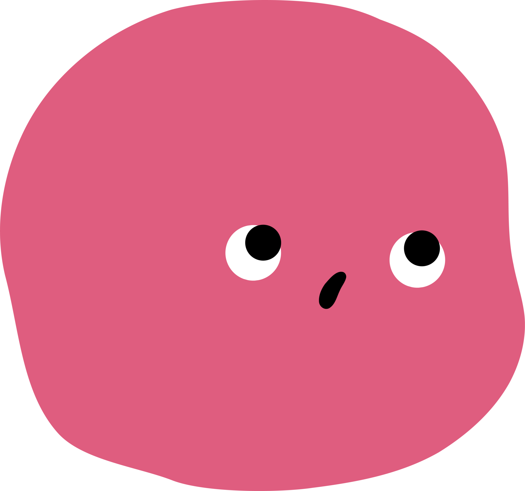
Pink
Ooh la la! Pink is often a color associated with femininity, but it also inspires feelings of youthfulness. To be “tickled pink” is to be delighted in a pure, almost childlike way. Pink is a color not often seen in branding materials. If you can pull it off and it aligns with a quirky, young brand personality, it could really help you stand out!
Orange
Orange is a color perceived as being a little off the wall. It radiates playfulness and the positive feelings that go along with other warmed-toned colors. Orange boasts an air of confidence and creativity. It definitely does not project seriousness or solemnity. This is a non-corporate color reserved for the bold.
Yellow
Yellow is often referred to as the happiest color. It’s bright and sunshiney! It’s frequently used to forecast a good time, and similarly to orange, indicates upbeat creativity. However, yellow can elicit uneasiness as well. Sometimes, yellow signals cowardice (yellow-bellied), apprehension, or caution. It’s not always sunshine and rainbows with this one!
Green
Green is a color we know has become especially popular in recent years to brand companies and initiatives as eco-friendly, natural, and calming. It’s no secret that it’s associated with growth and nature. It’s also used often in financial marketing and messaging about money in our culture. Because of its occurrence in our natural world and it’s more popular use in recent years, green can be seen as a stagnant or “boring” choice. Jazz it up with an accent color and make sure not to play it too safe.
Blue
The results are in and would you believe them?! According to a 2015 study, most people’s favorite color is blue! And there are more blue logos out there than any other color. Blue is thought to be a calming, soothing color. It also signals trust and dependability. But watch out, it can also be associated with sadness or unfriendliness and a cold demeanor. What’s got you so blue?
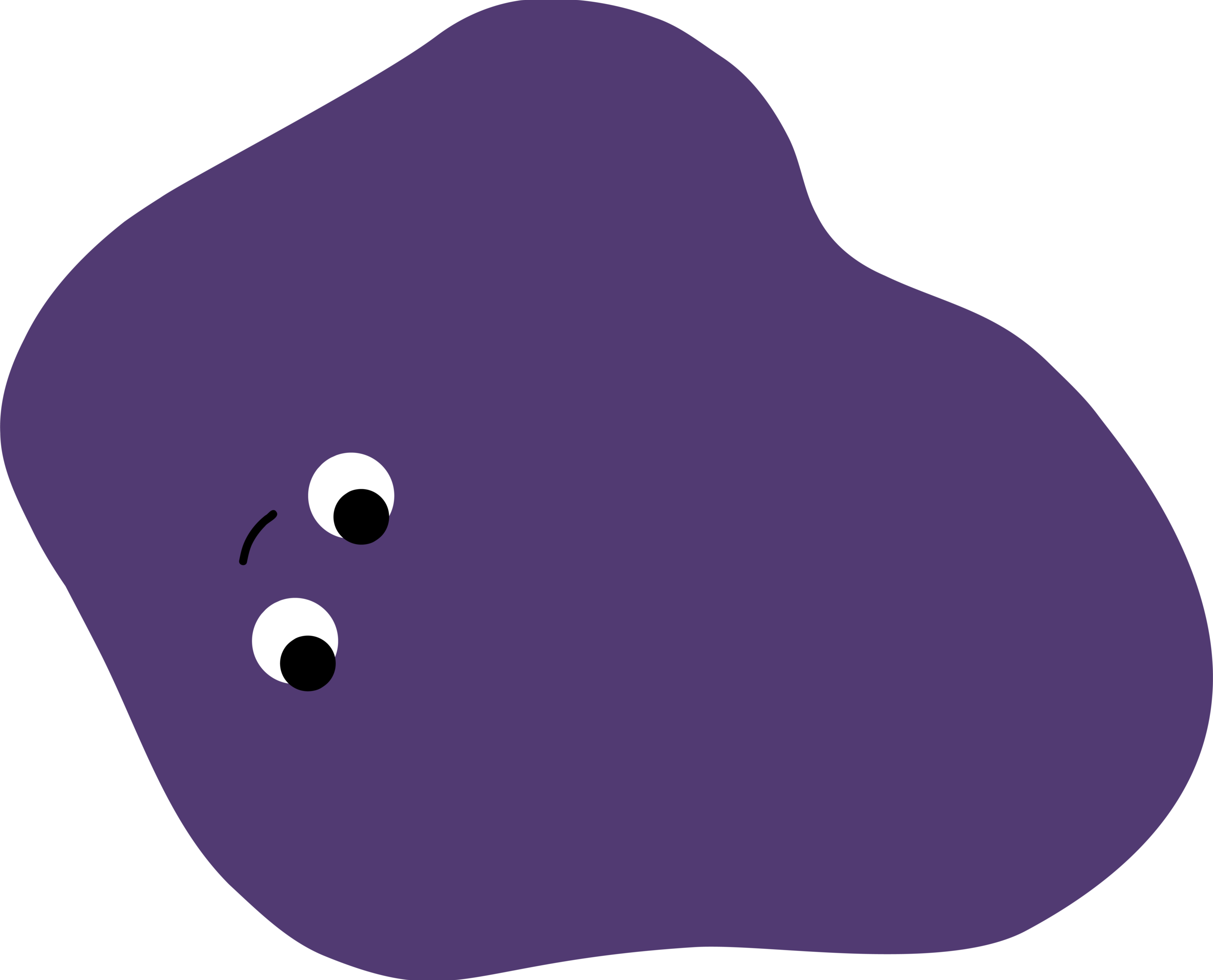
Purple
Perhaps the most regal color of them all, purple oozes sophistication. Not only is it often seen as a symbol of wealth and status, purple can also indicate a wealth of knowledge. For all its strong associations, not many popular brands have latched onto this color. There may be an opportunity to stand out with a purple hue!
Black
Black is a color often used by luxury brands. Chanel, Gucci, and Prada all use black as their primary color as it projects a sleek, refined look. Similar to purple it symbolizes sophistication. However, it is possible to lean too far into the serious – the gravely serious. Yes, black does also symbolize death. It is a staple color and used everywhere, but in certain industries, its overuse can come off as a little tone-deaf. Imagine the color black being associated with a hospital, for instance.
Whatever your next design, Fuzzy Duck will work with you to get the colors just right! When designing a logo, for example, we do it in black and white first to get the form right before adding in color. Then, we’ll show you a couple of different colorways and work from there to whittle down the best color combo that aligns with your desired tone.
If you want to know more about how psychology and design work together, check out our post on the psychology of shapes!
