The Psychology of Shapes
Lauren Addy
June 24, 2020


Certain simple shapes have developed meaning to us as human beings due to their occurrence in nature. Animals to be more specific! Think back to your bedtime stories, didn’t you have a certain expectation for the characters based on what type of animal they were and the way they were represented in the illustrations on the page?
Branding and character design use that same concept of shape to tell a nonverbal story about themselves, and all you have to do is look at them. Your subconscious will do the rest.
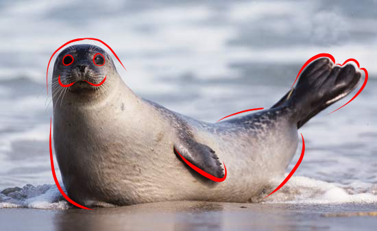
Seals are the perfect example for circles. Circles are soft features in design. The positives of having something with soft features are friendly, loveable, kind, and easy-going. The negatives are childish, naïve, and immature.
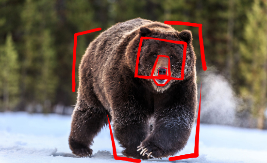
Bears are a great example of how we see squares. Squares are harsh and sharp features. The positives of harsh and sharp features are sturdy, reliable, unflinching, and strong. The negatives are strict, stubborn, not adaptable or flexible, and moody.
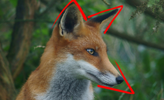
Foxes are a great example of how we see triangles. Triangles have pointy features that make us think of tricksters. The positives of being pointy: dynamic, edgy, and adaptable. The negatives: mischievous, break the rules, or villainous.
Psychology of Lines
Shapes and line direction go hand in hand to nonverbally communicate a message. Line direction can be the overall line use in a logo to the action line of a character pose. An action line is the direction and movement a character has.
Vertical Line
Alert, and ready for action. Think of your own posture, when we’re upright we’re awake and ready.
Horizontal Line
At rest, relaxed, serene. Think of laying flat on your back, at peace with your surroundings.
Diagonal Line
Action! There’s no hesitation because you’re already running!
Shapes in Branding
Now that we have an idea of the basic shapes and their meanings we can talk about how that affects branding and marketing. When you are trying to visually portray your brand through icons, characters, logos, business cards etc… you want to make sure your audience is getting the right idea of who you are, what you do, and most importantly how you do it.
There are positives and negatives to every shape, but if you use them for the right audience the positives will shine brightly.
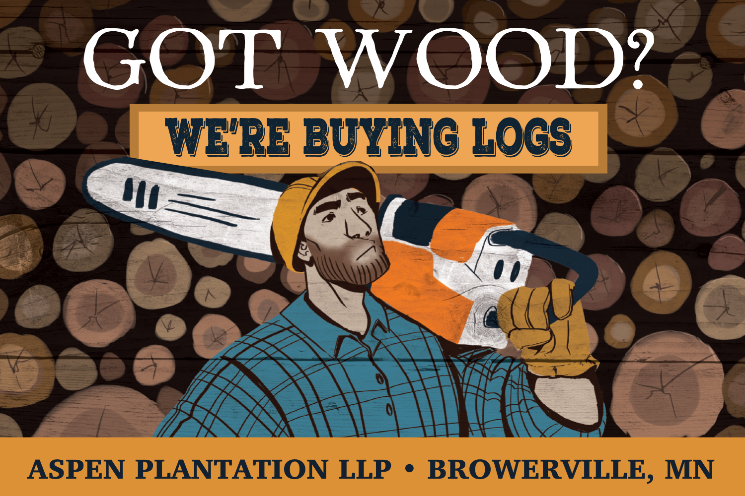
Aspen Plantation Lumberjack
To circle back to character design, a lumberjack character for Aspen Plantations campaign: “Got Wood?” was created. Rounded corners make him friendly while his large square chest and jaw make him feel sturdy and reliable. This tells us that this business is friendly, reliable and strong. When dealing with lumber, strength is a good thing to show.
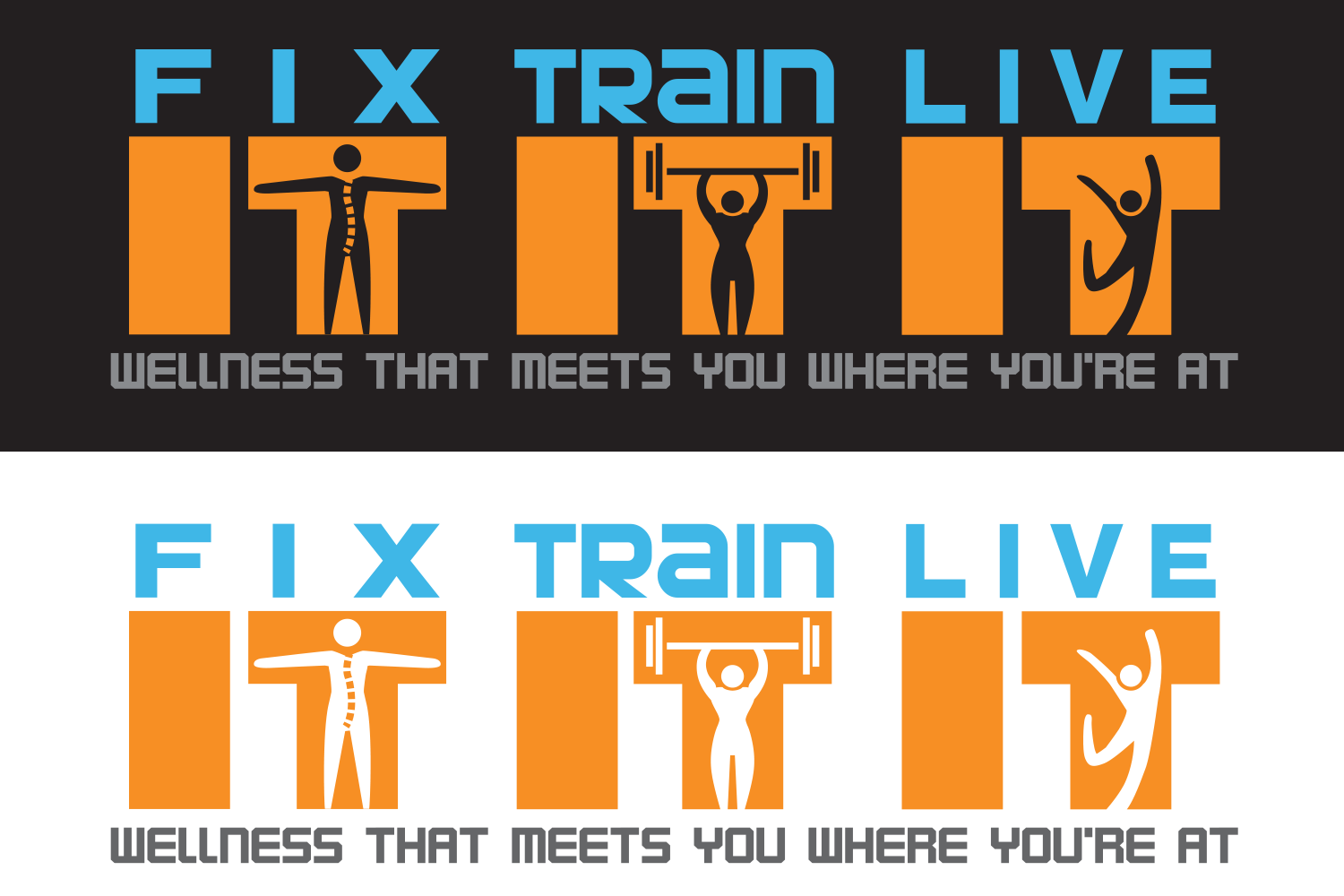
Fix it. Train it. Live it.
Bold, square and strong. The logo has strong vertical lines that imply being awake and alert. The last icon for “Live” is made of diagonal lines to be in action. There is a lot of action and preparing for action in this logo, as a fitness brand would need!
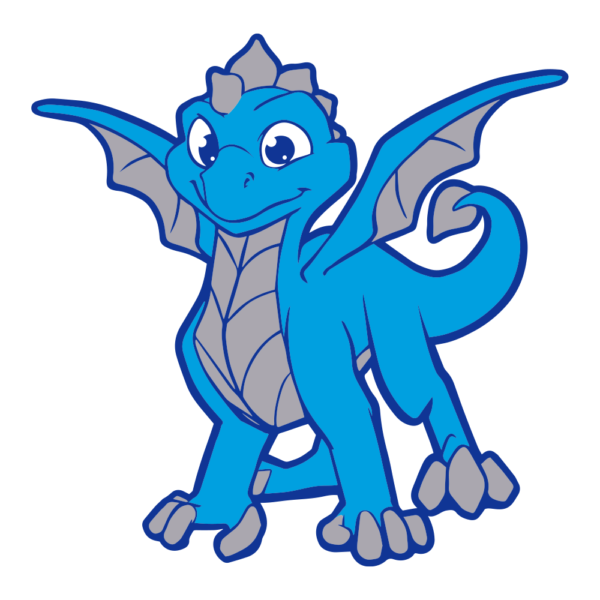
Holy Name of Jesus – Mascot
A great example of circular design is the mascot from the Holy Name of Jesus Catholic School. Dragons can very easily look mean or unfriendly with harsh and pointed edges, but thanks to rounded edges, he looks very friendly. Perfect for child-friendly designs.
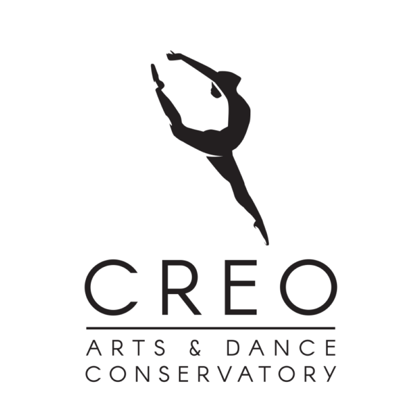
CREO Arts & Dance
Creo’s icon is made of energy and movement due to its diagonal line of action. The overall shape is very triangular which makes it feel more dynamic. CREO is a children’s dance company and nothing changes more than children!
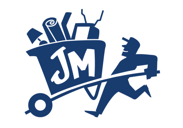
Junk Masters
Junk Masters has a lot of similarities to Fix it. Train it. Live it. with its usage of squares and lines. The icon’s diagonal lines make him feel like he’s in action taking away that wheelbarrow.
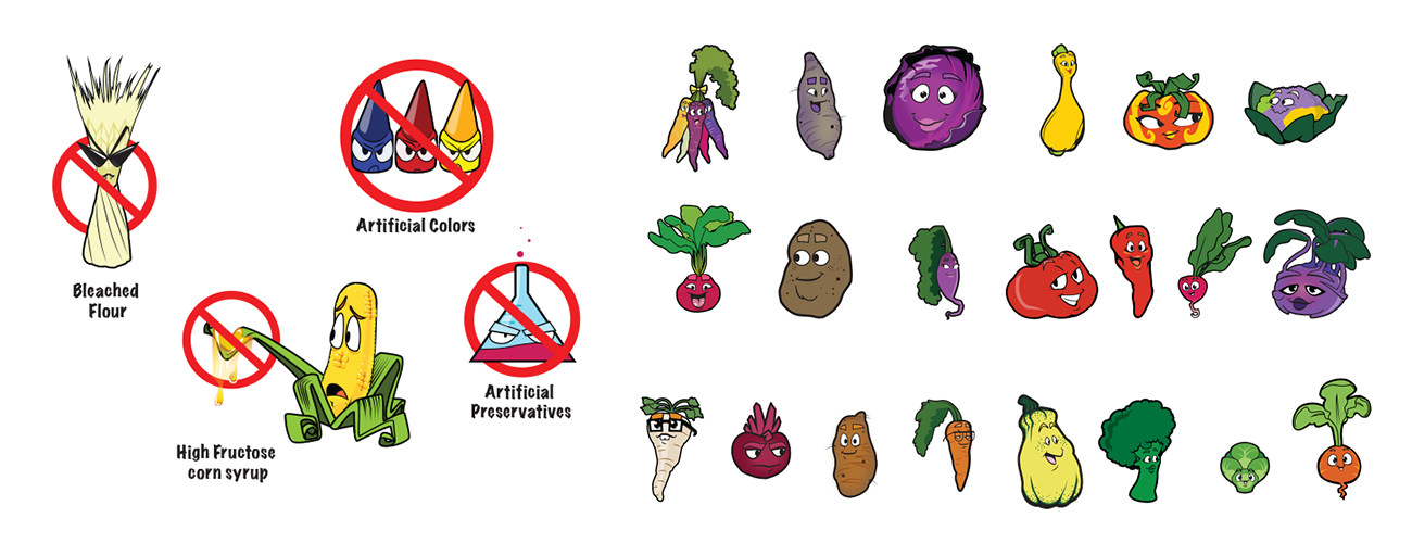
Culinary Express
Shapes can also tell a straightforward story of good and bad in your messaging, our concept of shape and meaning is so ingrained that even as children we can feel the difference between a “villainous” shape and a “friendly” shape. Culinary express wanted to take out bad ingredients like bleached flour, artificial colorings, and other such unwanted additives out of kid’s school lunches and add more healthy vegetable options. The unwanted ingredients were designed with shapes that were pointy, sharp and villainous as characters. The veggies were rounded and friendly looking to be “good” guys to be the more appealing choice to their family audience.
Conclusion
Shapes tell a very important nonverbal story and make up a huge part of the audience’s first impression of not only what one’s business does but also who they are. A good logo, icon, or character can immediately tell your audience if you are indeed who they’re looking for.
If you’re looking for a new illustration, logo, or animation for your business, contact Fuzzy Duck today for a free consultation.