How We’re Making A Splash
A small sampling of work accomplished over 30 years while helping our clients win. Take a peek and imagine the impact a creative marketing partner could have on your business.

Case Study
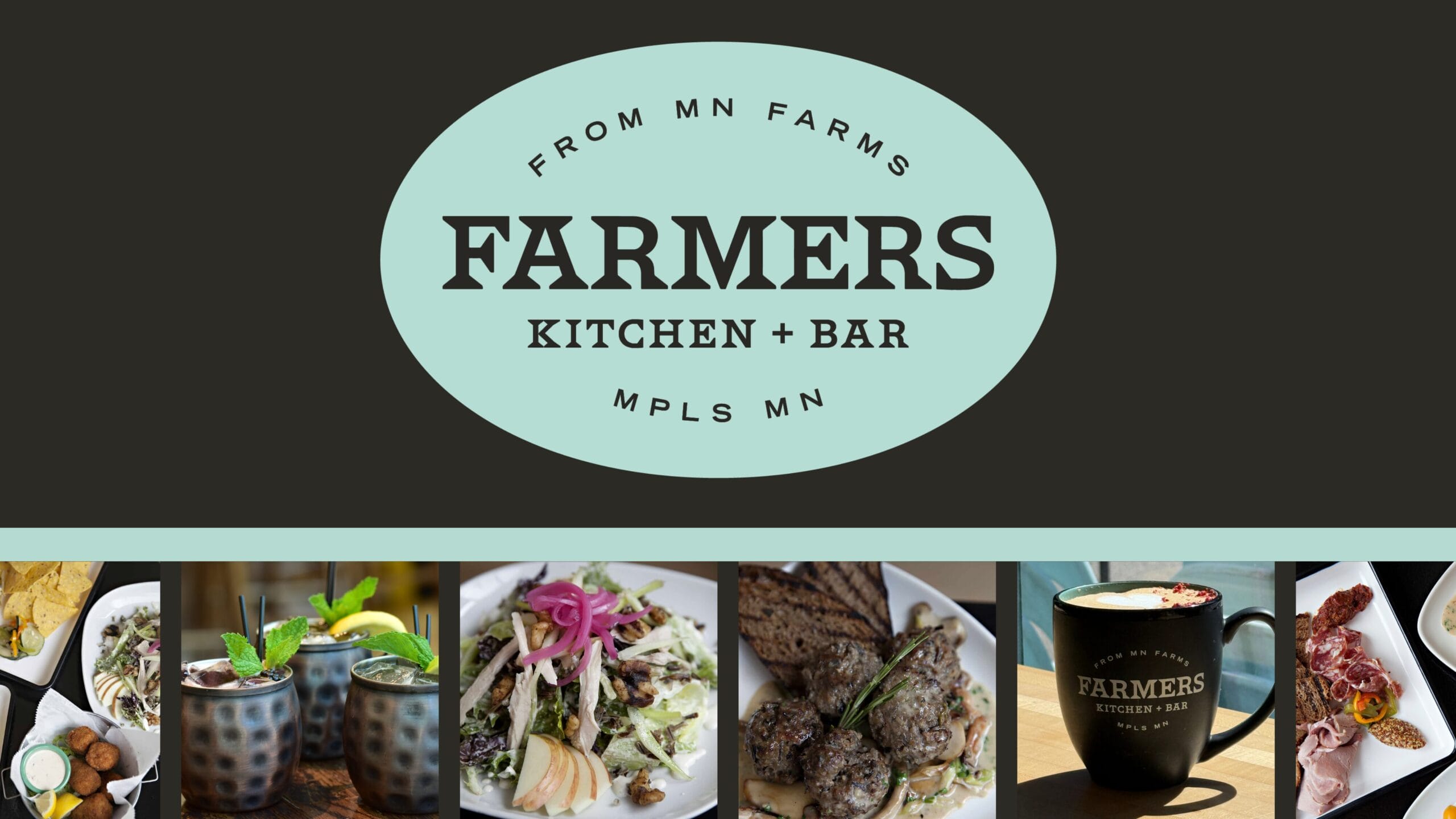
Fuzzy Duck's partnership with Farmer's Kitchen + Bar is proof that great things come from dedicated teamwork.

Case Study
Fuzzy Duck has been working alongside EarthDaily since 2021, acting as an extension of their internal team.
Case Study
Strong SEO isn't a one-time fix. It's an ongoing investment in showing up when and where potential customers are searching.
Case Study
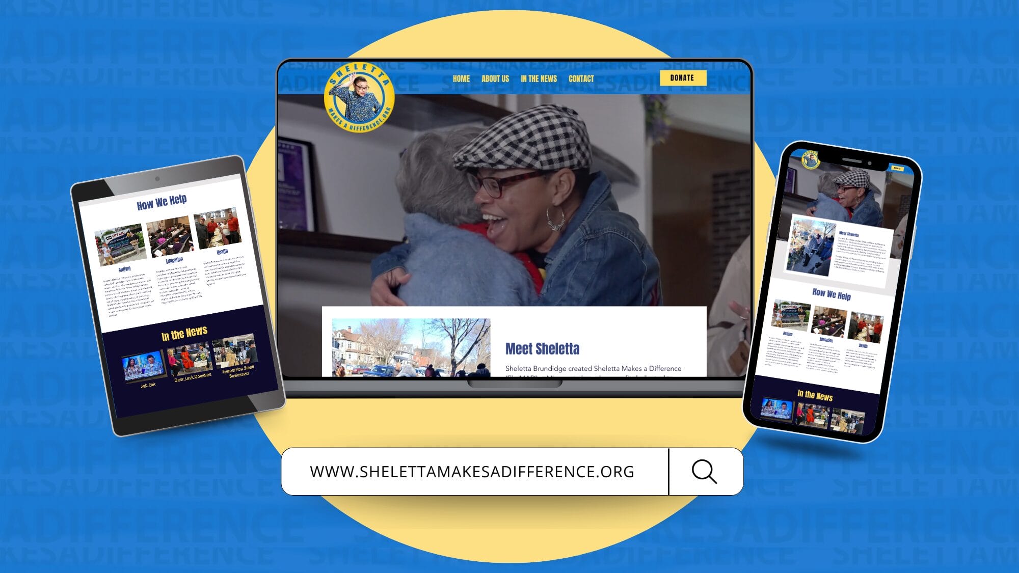
SheMAD exemplifies the kind of community-focused, determined advocacy that creates real change.

Case Study
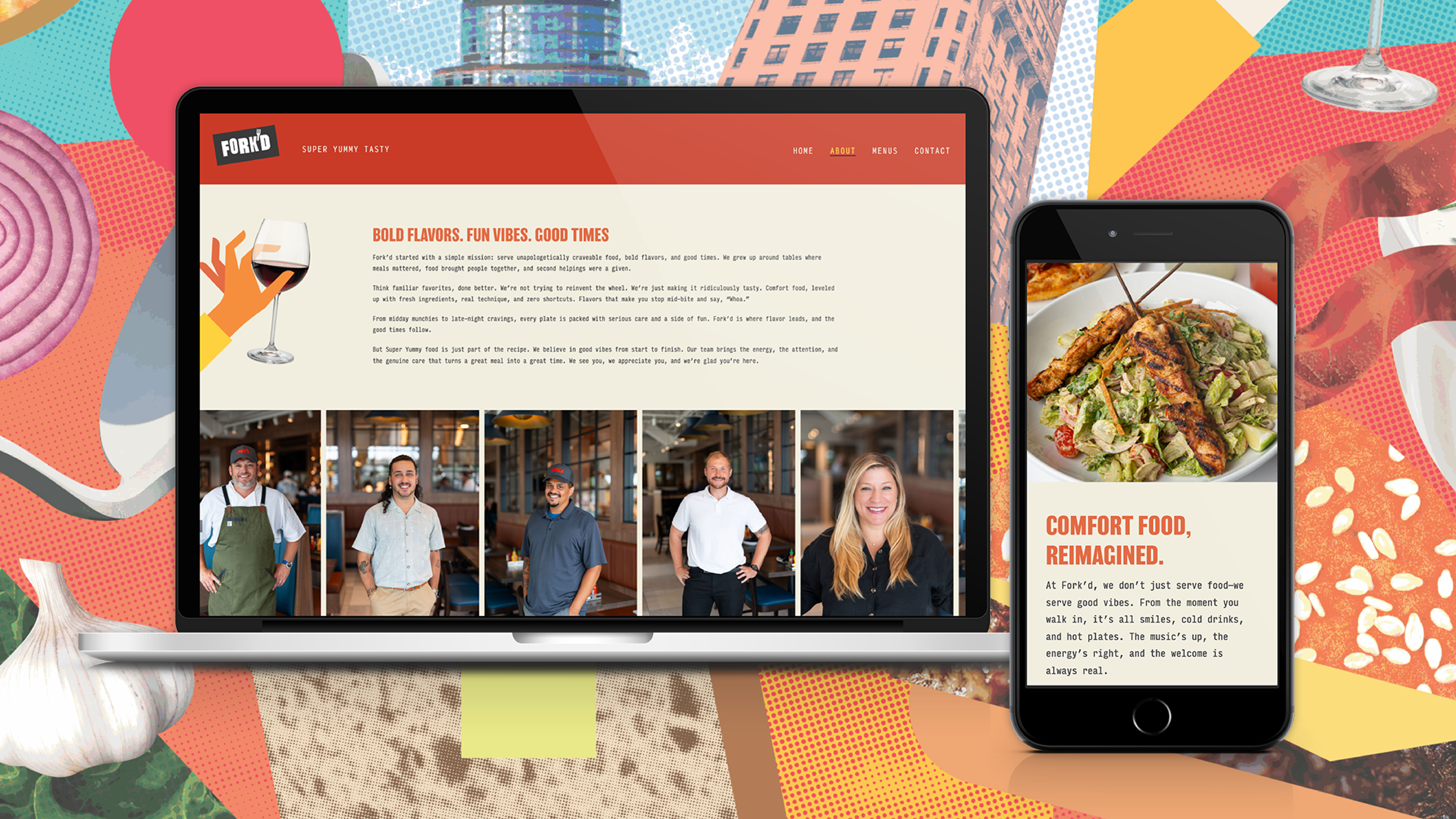
Classic Italian charm meets welcoming warmth for this new restaurant concept brand.
Case Study
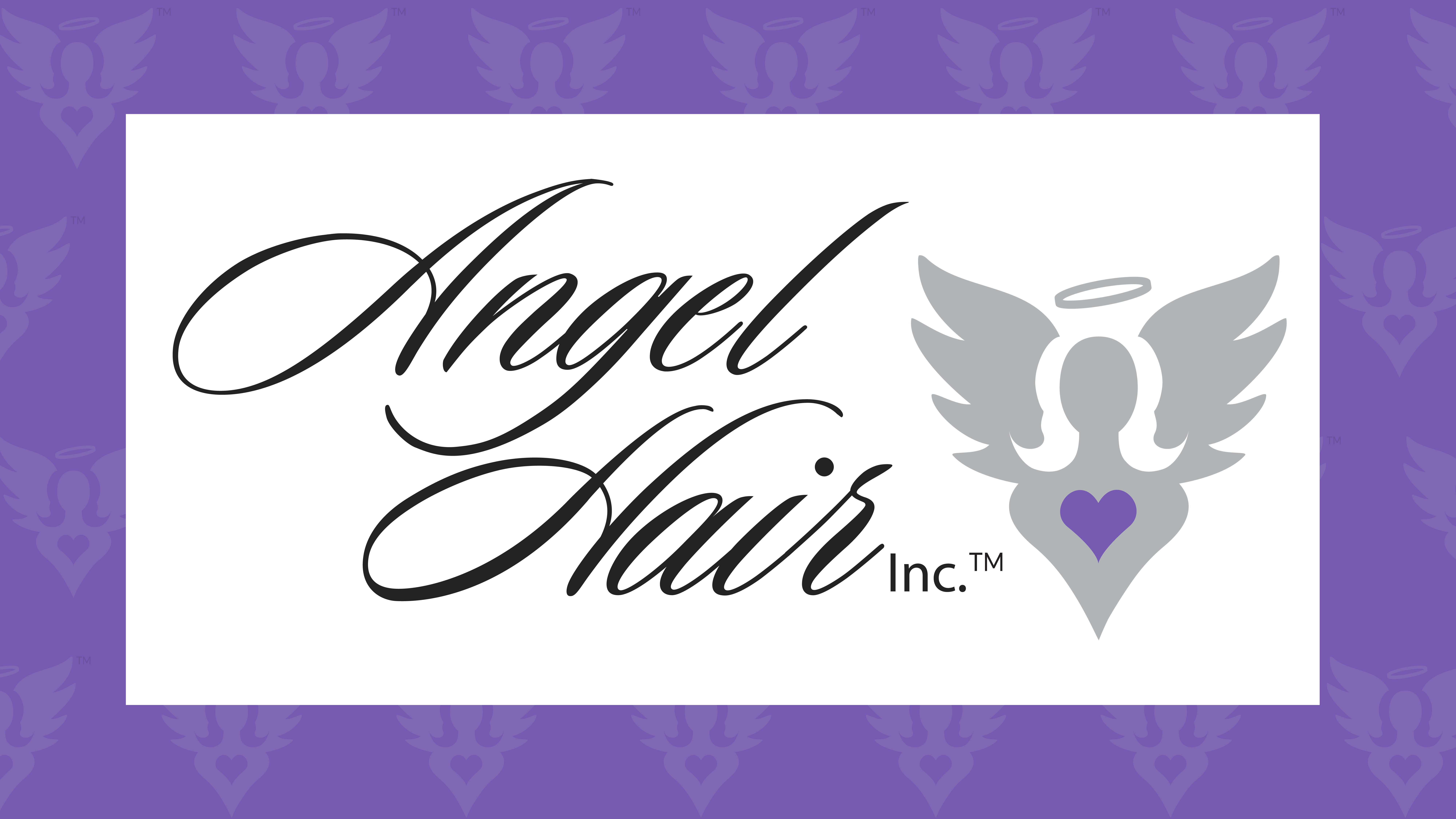
For a nonprofit dedicated to giving back to others, we created something special just for them.
Case Study
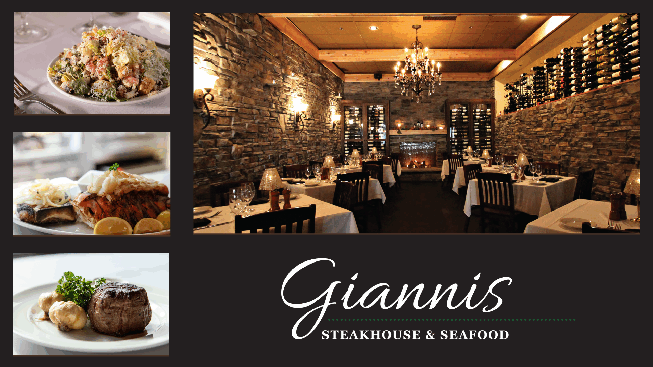
Gianni's represents everything we value about long-term creative relationships.
Case Study
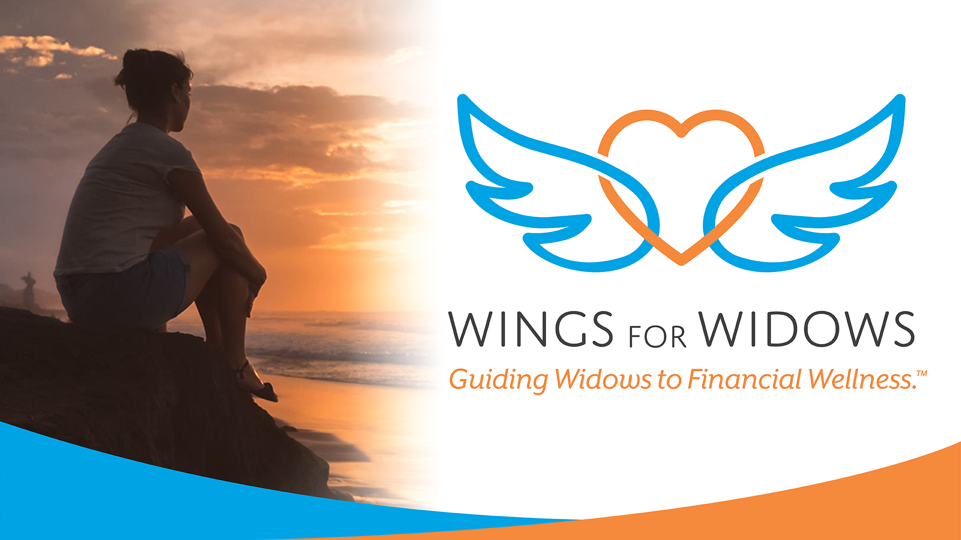
Fuzzy Duck is proud to have played a role in building the foundation that supports Wings for Widows' vital work.