ElMar’s NY Pizza
Infusing Some Flavor
Well-designed restaurant menus invite diners to dig in by organizing offerings clearly, and helping guests easily find their favorites. Our print designers use distinct sections, font types, and varying sizes to direct eyes as they move across a menu. For ElMar’s, we incorporated fun brand elements that emphasize their New York roots, like the Manhattan skyline and a wordcloud pattern. Restaurant menus should always be clear, inviting, and on brand.

Serving Up Bold
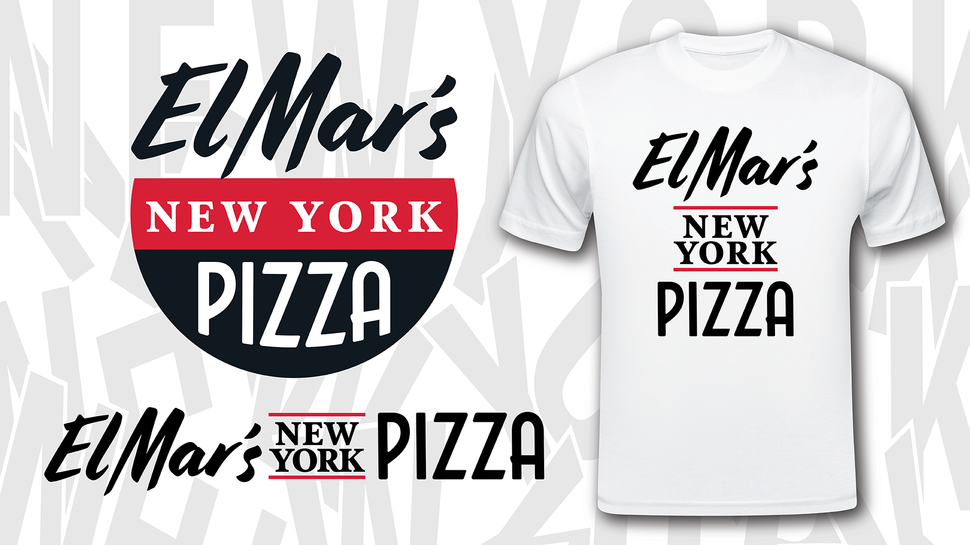
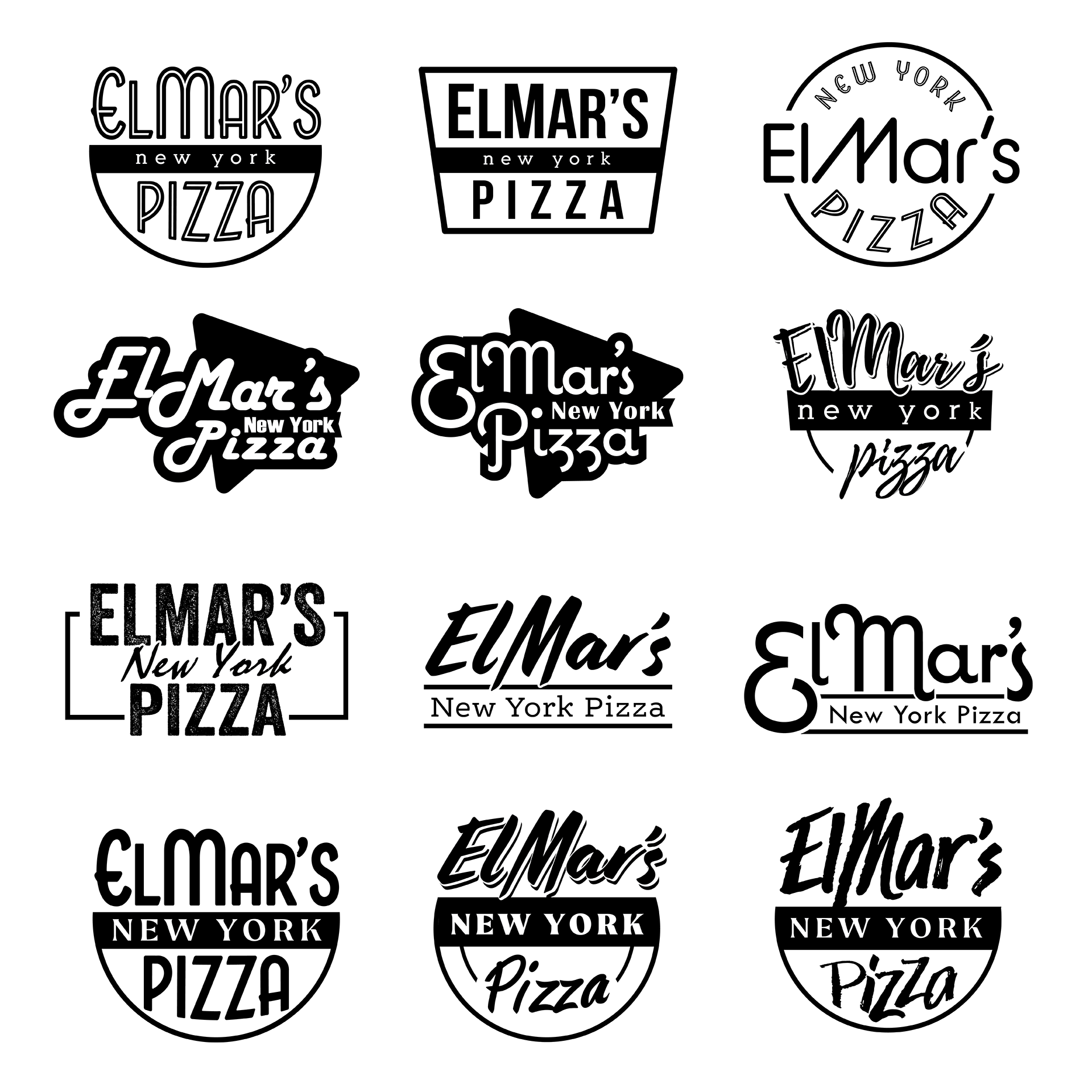
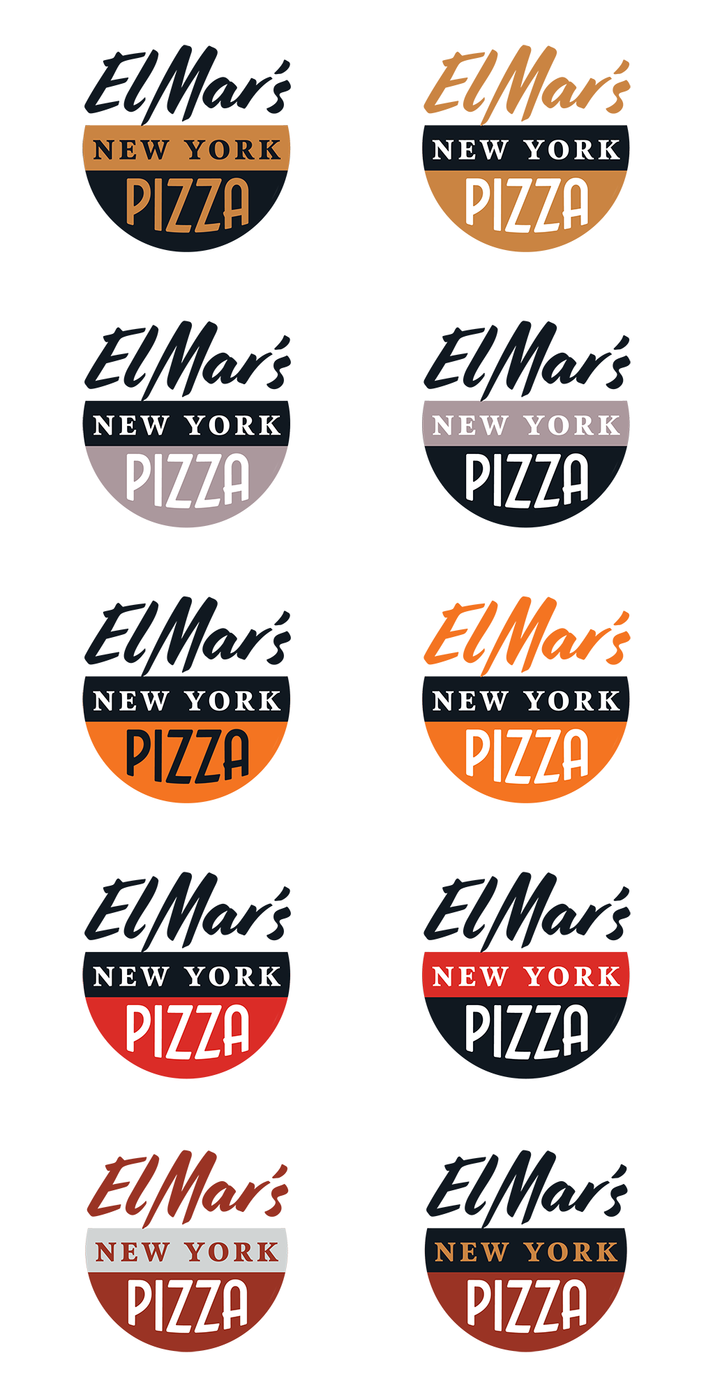
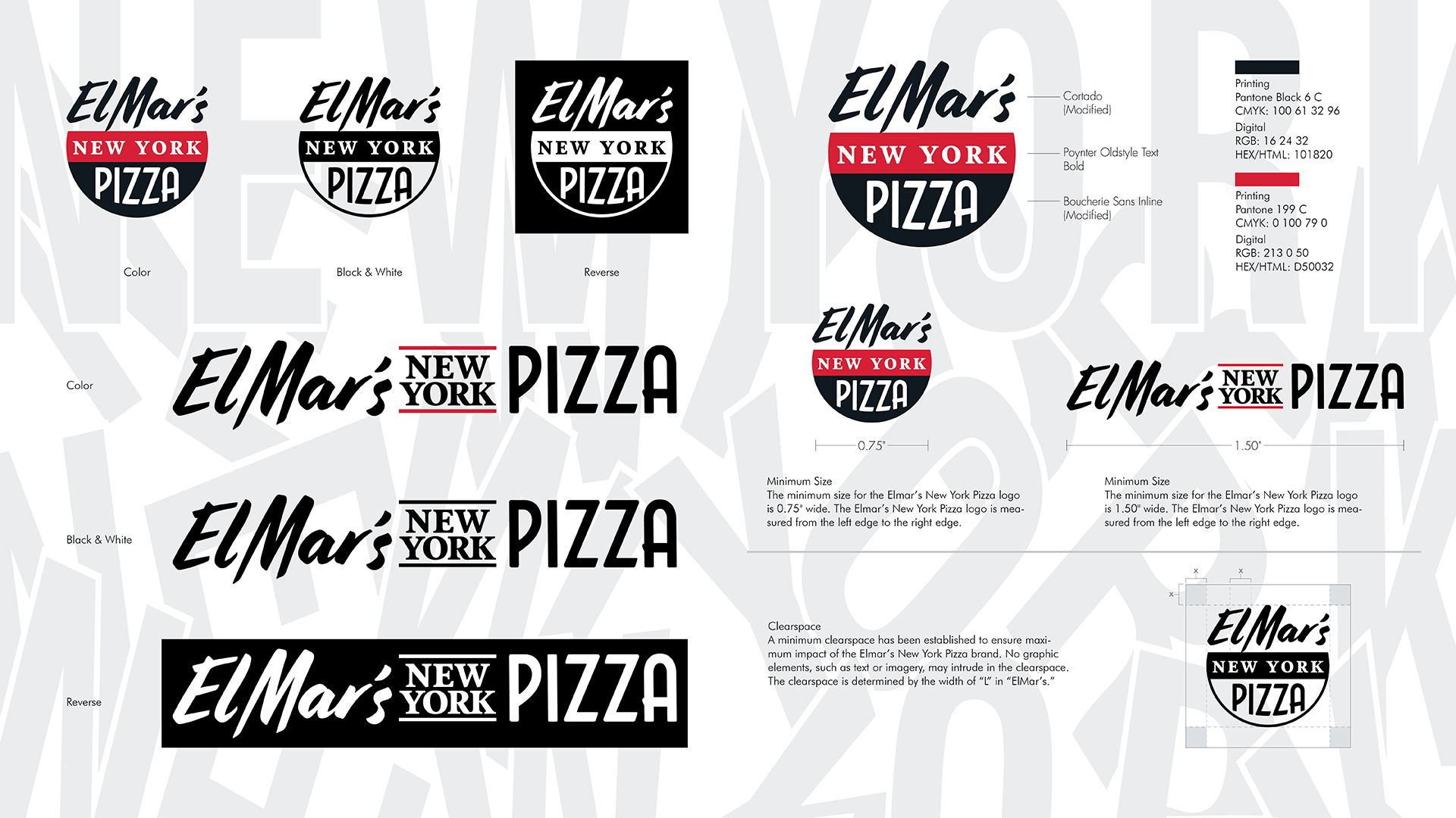
ElMar’s logo needed to be iconic in and of itself. It was designed to have a strong visual impact! Part of the reason for this is that it would become their building sign, welcoming visitors to their pizza paradise. The script font selected contributes to that comforting, home-cooked feel of their brand while remaining professional. The logo also needed to hold up to being reduced in size for use on smaller design elements, like menus, business cards, etc. The final look is stark, bold, and simple – its red color is a proven appetite stimulator.


Creating That New York Feel
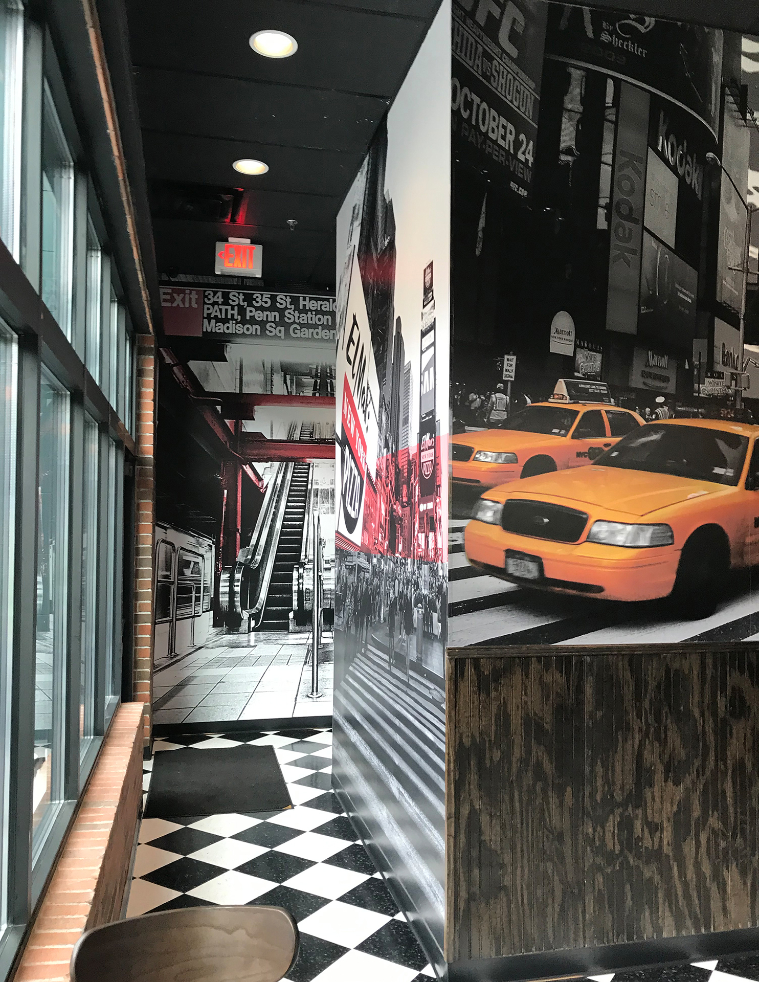
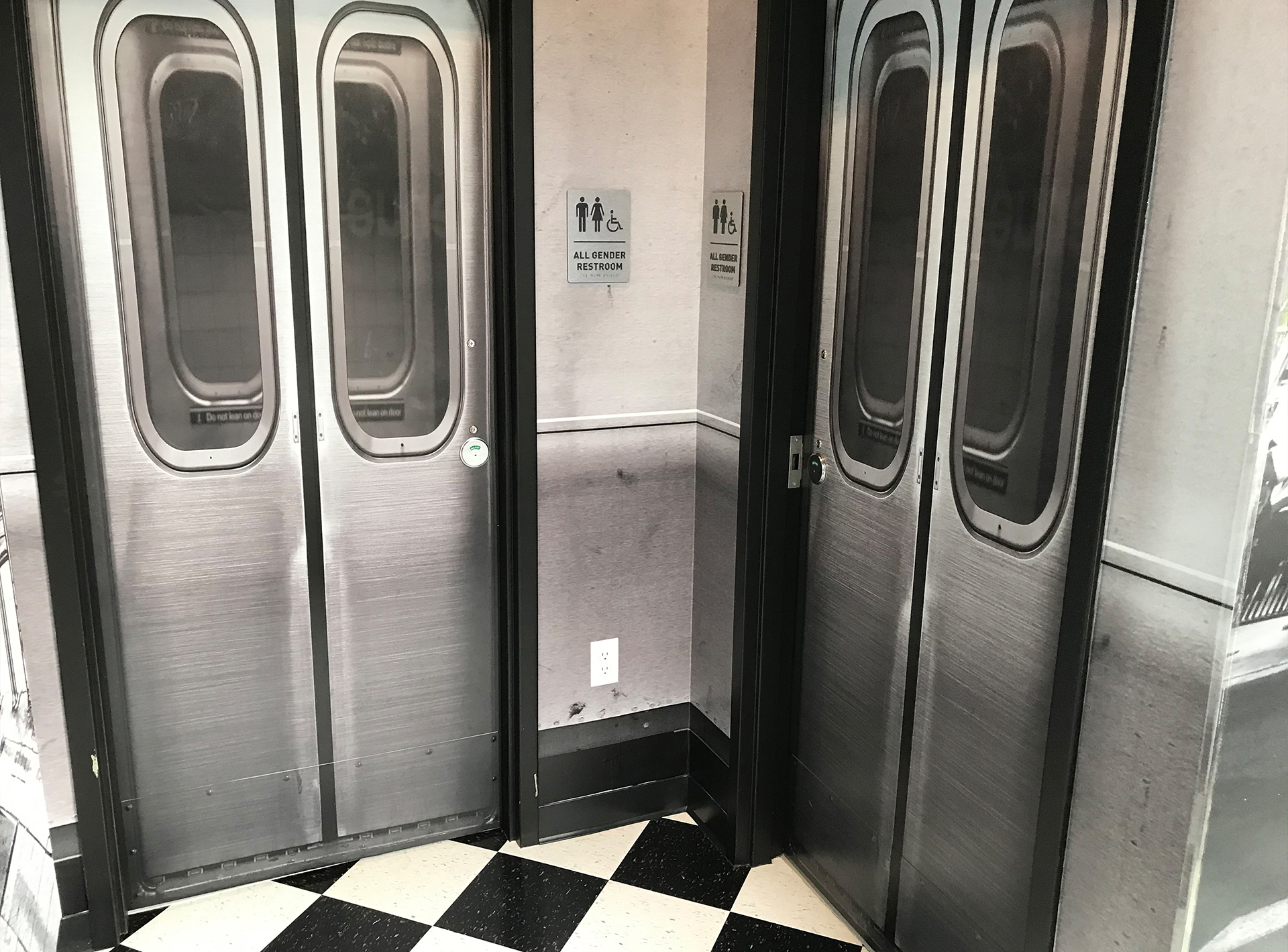
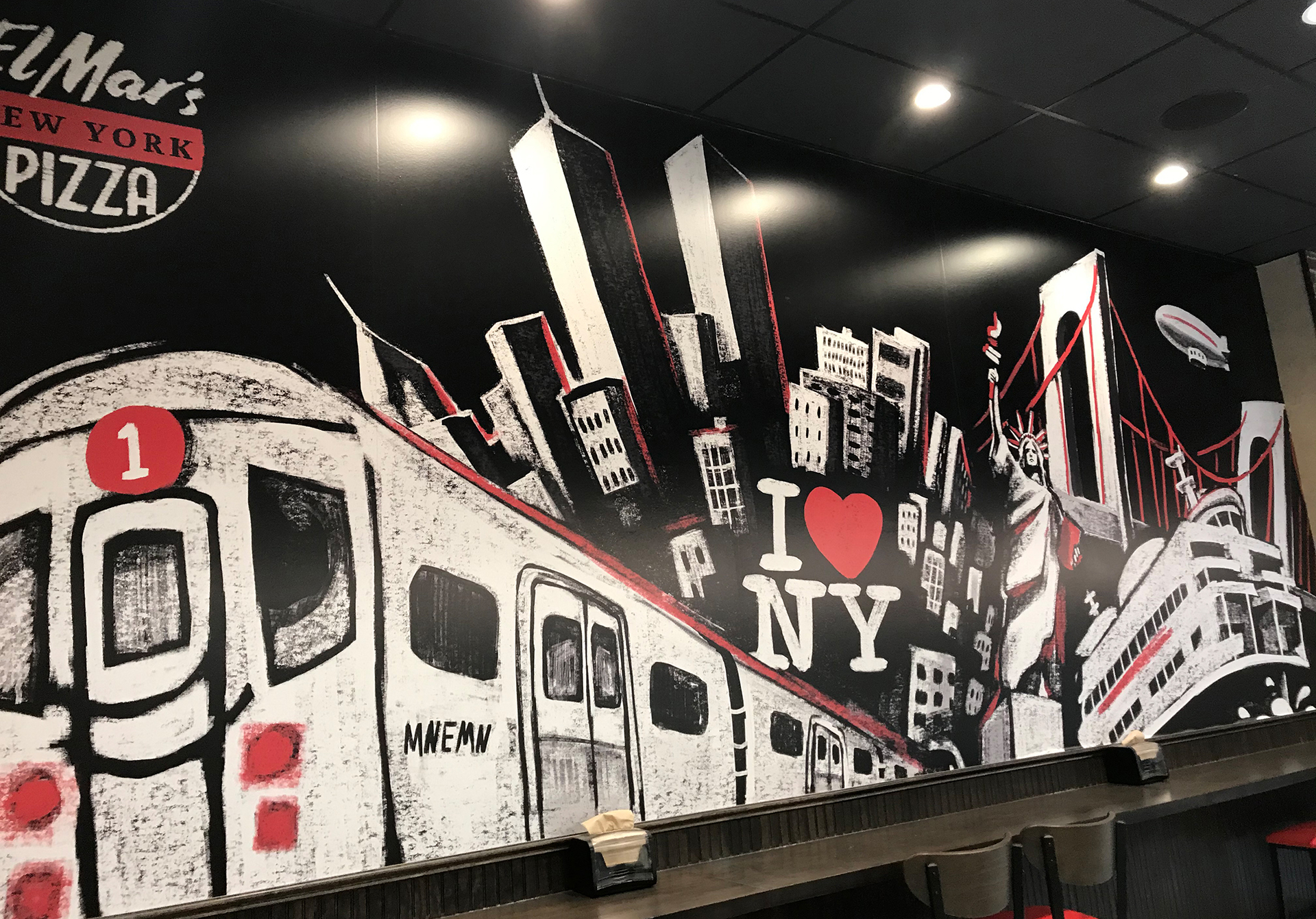
A unique element of restaurant marketing involves getting creative within the restaurant itself. When you walk into ElMar’s, it feels distinctly ElMar’s. The best restaurants curate an in-store environment that supports the brand and enhances the guest experience. To accomplish this, we created custom murals: photos of the iconic yellow taxi cabs and Times Square skyscrapers as well as a striking, wall-spanning chalk mural. Feast your eyes on the space!


Your Creative Marketing Partner


