Comal
A Brand in Motion, With a Business to Run
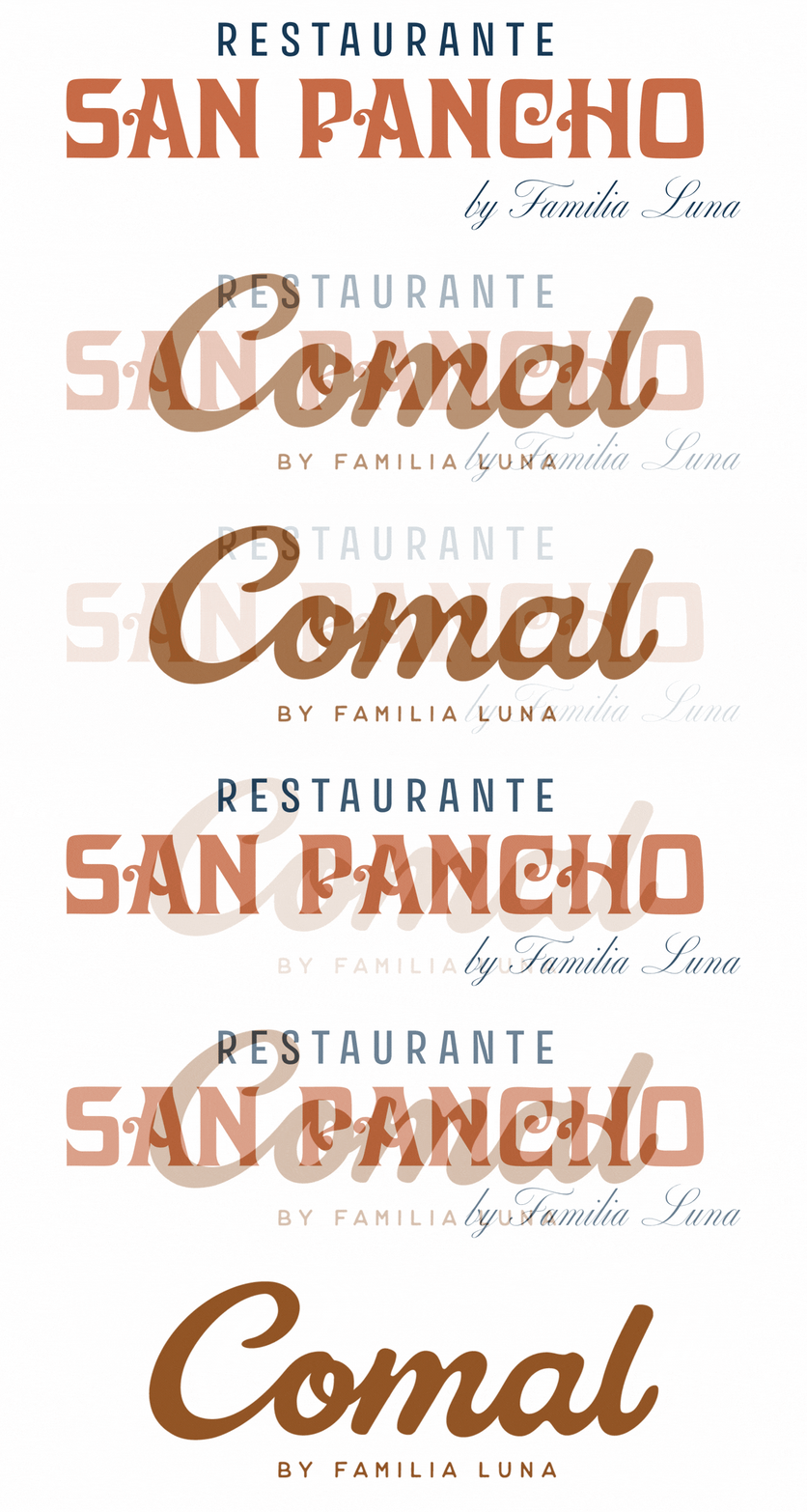
Their plan was clear from the first meeting. Angel and Finesse would take over the existing San Pancho brand and menu to ease the transition for staff and guests. Then, they’d gradually roll out their new concept under a new name.
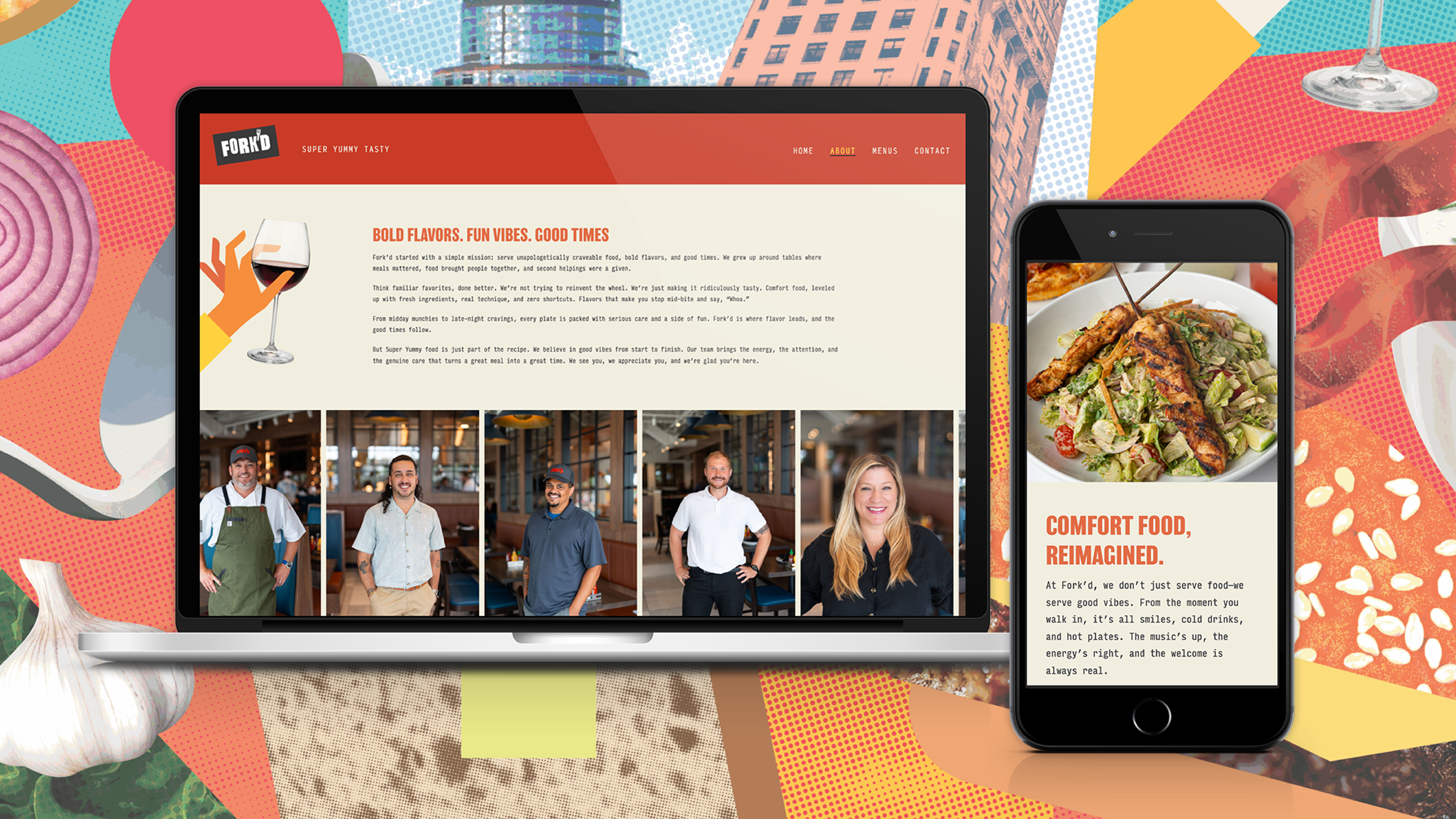
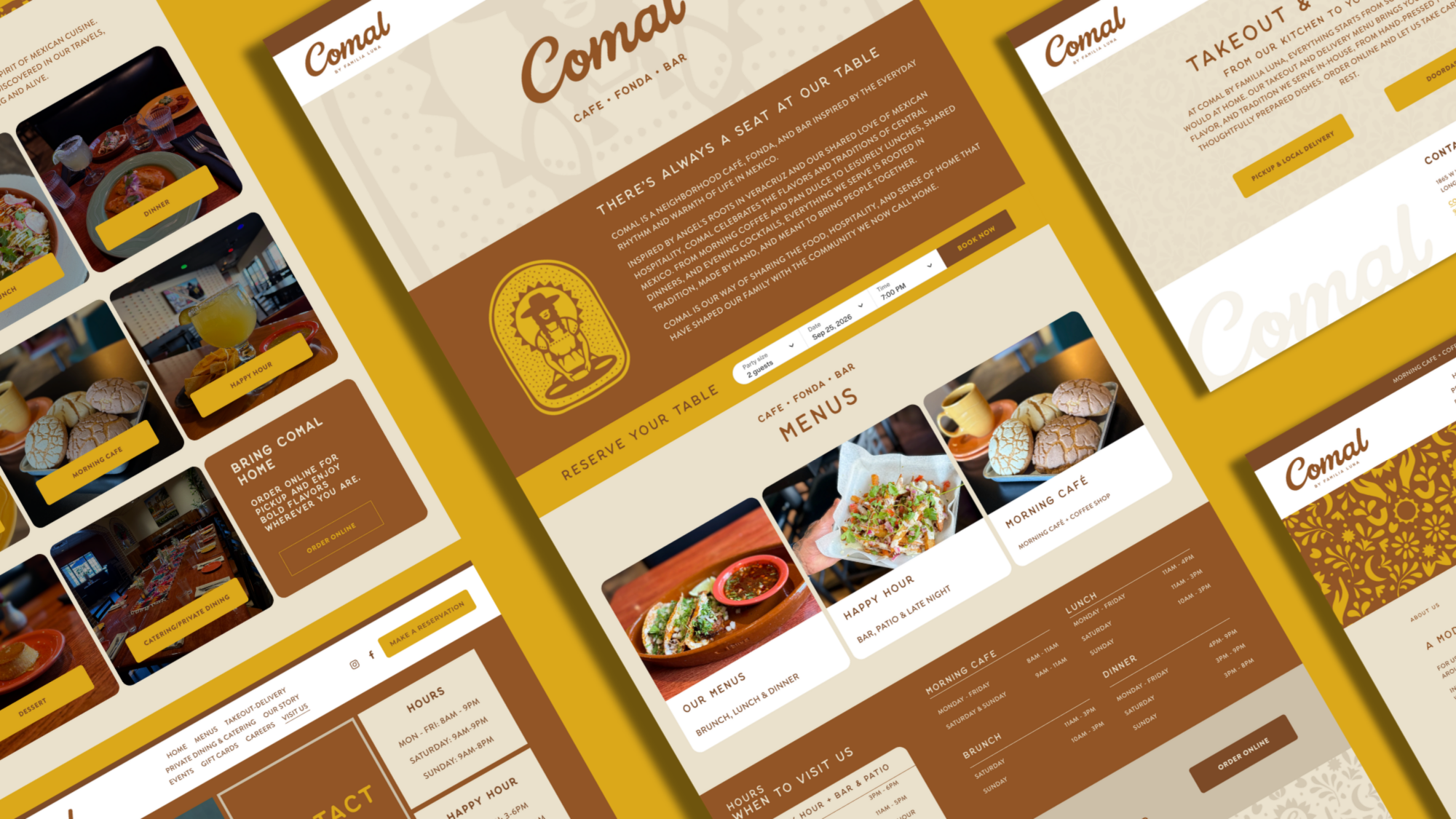
Fuzzy Duck’s first job was to help bridge that gap. We refreshed the existing San Pancho logo package and built a fresh Squarespace site to carry the brand through the transition period. We built a focused, organized site with all the key pages they needed. From rewards to gift cards, private dining to menus, careers and more. Restaurant websites are some of our favorite (and most frequent) projects.
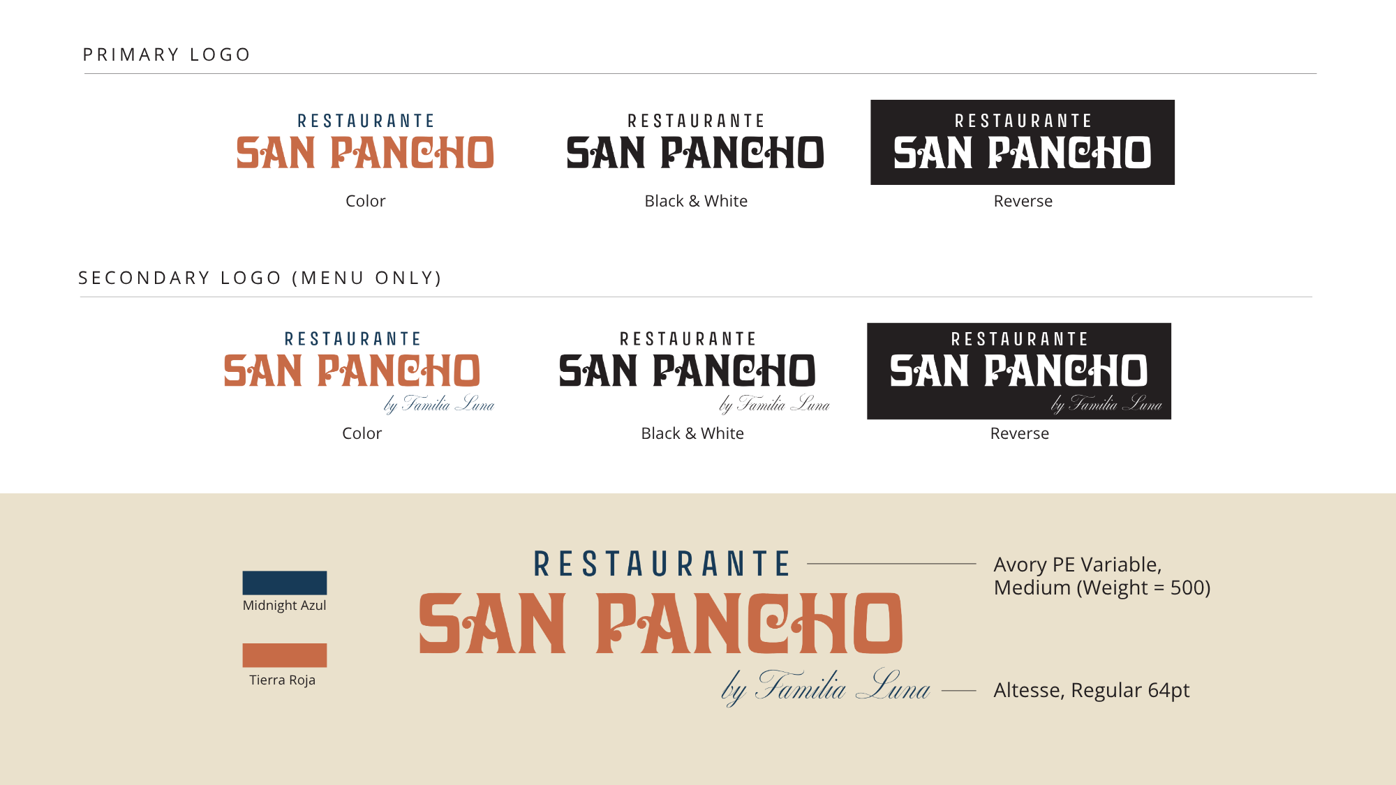
When it came time to create the logo for the new name, Angel and Finesse got an offer they couldn’t refuse from another talented agency with family ties. While we hate missing out on a logo development, we understand when clients use multiple sources to accomplish their goals. Our mission at Fuzzy Duck is to help small businesses win, even when that means we aren’t the only ones contributing to that win. Bottom line, we play well with others.
A Great Brand Needs to Land the Right Way
What happened next is where a strong start built momentum.
Angel and Finesse understood that a beautiful visual identity is only as good as its execution. A great logo doesn’t build recognition on its own. The Luna’s wanted a partner they trusted to take over bringing the brand to life. We’re honored they chose us.
After receiving the completed brand assets, including new logos, a refined color palette, updated typography, and supporting graphic elements, Fuzzy Duck got to work making sure every piece of the brand showed up the way it was meant to.
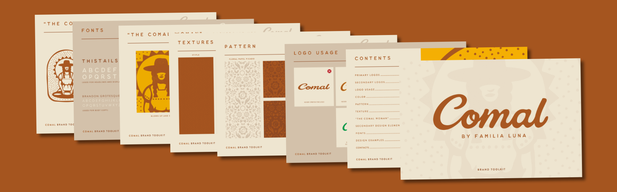
We audited first. Before a single file was updated, we mapped every existing touchpoint that needed to change. There’s a lot of moving pieces to a restaurant. Business cards, gift cards, menus, signage, a website… the list goes on. Every touchpoint needs to be accounted for to create a cohesive and consistent brand identity.
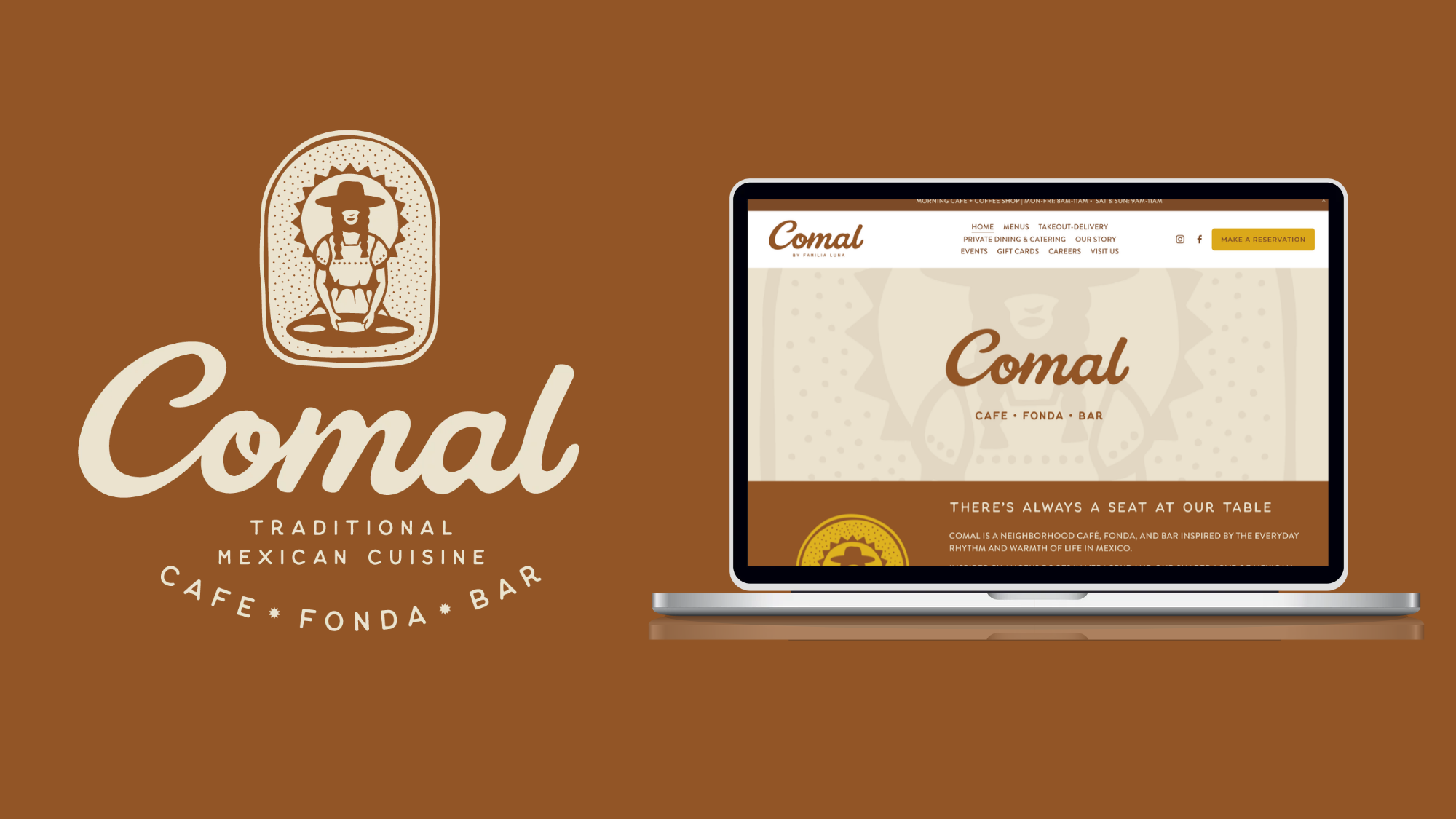
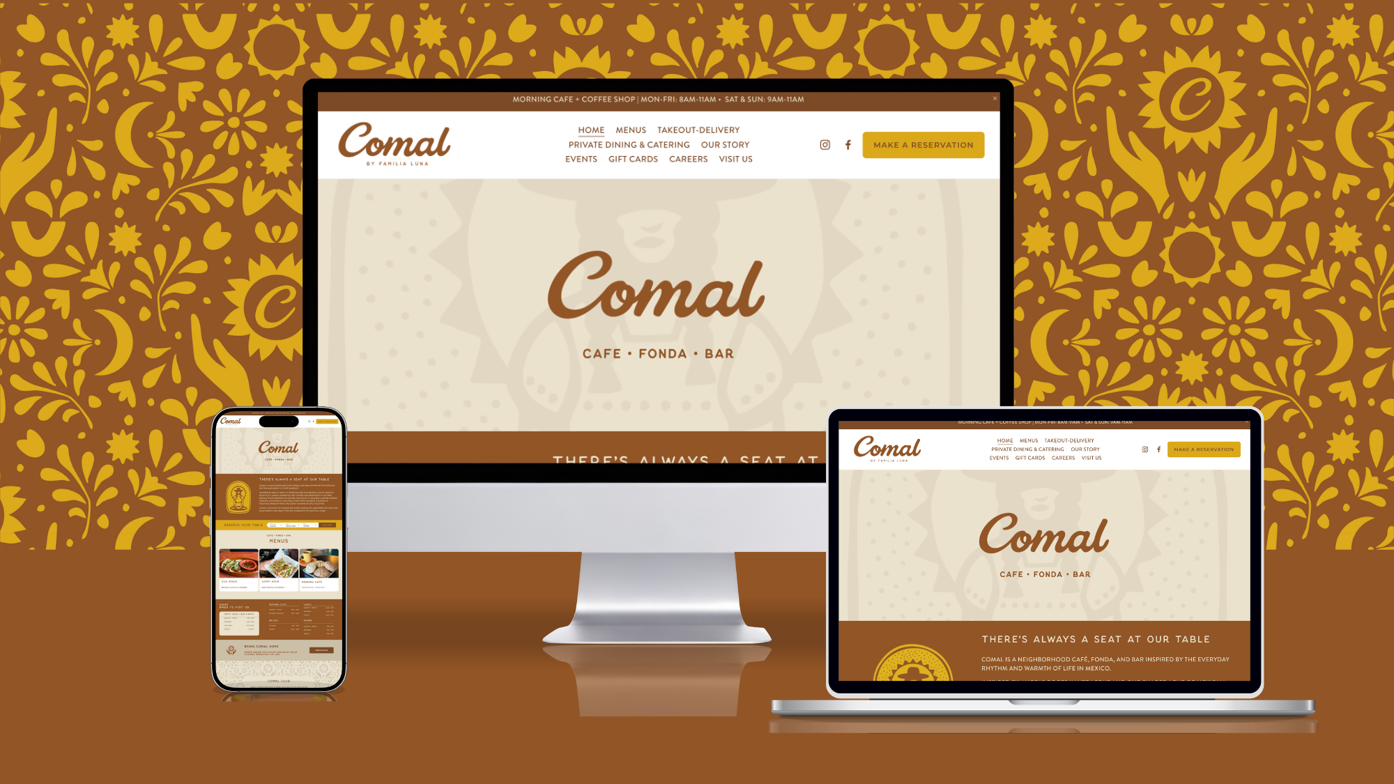
Then we got to work. The existing San Pancho site was updated with the new identity throughout. Logos, colors, typography, imagery, and body copy were all brought into alignment with the new brand standards. We also handled the domain updates and redirects to make sure nothing was lost in the transition.
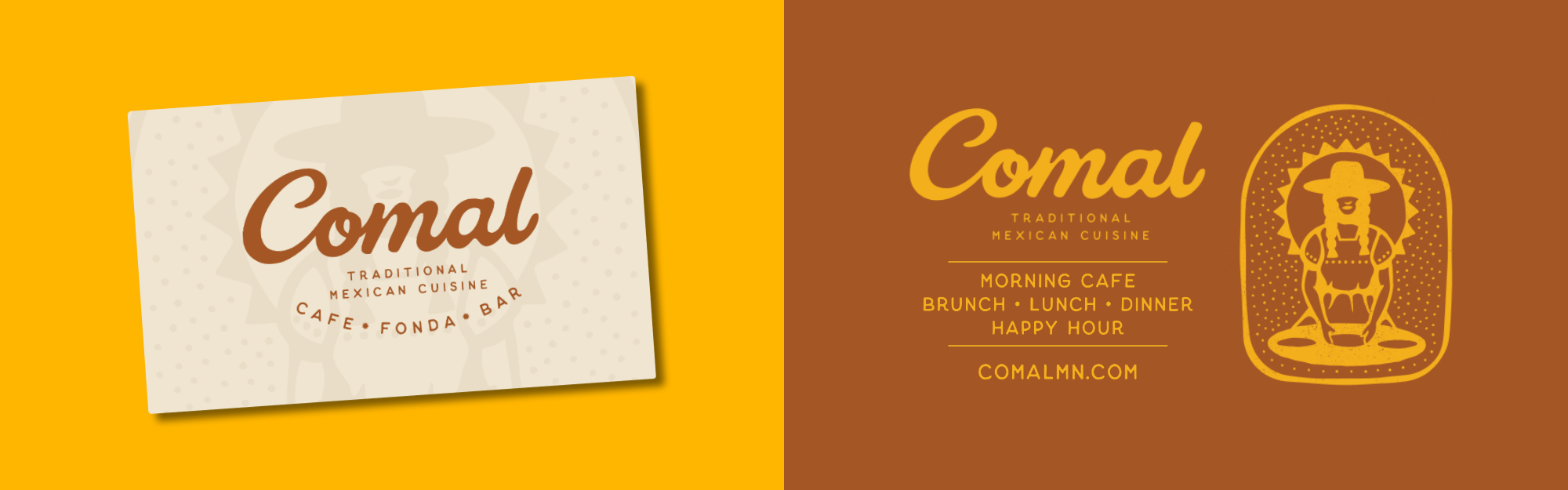
Finally, we made it live. After publishing the website, we stepped into a role we’re happily familiar with. We created a variety of supplemental items for Comal, like business cards, magazine ads, signage, gift cards and menus. These are the elements that are easy to overlook but make a huge impact of the experience of restaurant goers.
Comal Is Out in the World
Today, Comal by Familia Luna is thriving. The transition from San Pancho to Comal was handled deliberately to avoid visual whiplash that can confuse loyal customers and undermine a new identity before it has a chance to take hold.
For any business navigating a rebrand, we’ve picked up a few tips over the years that make a big difference in the rollout.
1. Implementation is its own expertise. Developing a brand identity and executing it across touch points are two different skills. Make sure you have the right creative partners who can support you with both.
2. A clear system prevents confusion. Auditing every element before implementation begins means nothing gets missed. Everyone has timelines they want to meet, but when work gets rushed, the details are the first to get overlooked.
3. Consistency is what brings a brand to life. When every menu, every sign, and every page of the website speaks the same visual language, customers feel it. Consistency signals a company that cares, which is exactly what diners want when trying a new restaurant.